20  Case Study: Public Health and Epidemiological Data

20.1 Introduction: Integrating Exploration and Explanation in Public Health

Across the book, we developed a descriptive workflow that moves from type-aware summaries and associations to interactive exploration, interpretable machine learning, and communication-oriented visualization. This case study brings these pieces together in a public health setting.

The focus is intentionally practical. We work with a diabetes screening dataset and examine how interactive exploration and interpretable model summaries can support epidemiological understanding. We emphasize descriptive interpretation, transparent assumptions, and communication choices for mixed technical and non-technical audiences.

20.2 Public Health Context and Analytical Questions

We use the Pima diabetes data available in MASS (Pima.tr and Pima.te). The dataset includes physiological measurements and a binary diabetes outcome. While the sample is modest, it illustrates a common public health workflow where we combine exploratory visualization with interpretable probabilistic modeling.

We organize the analysis around four questions:

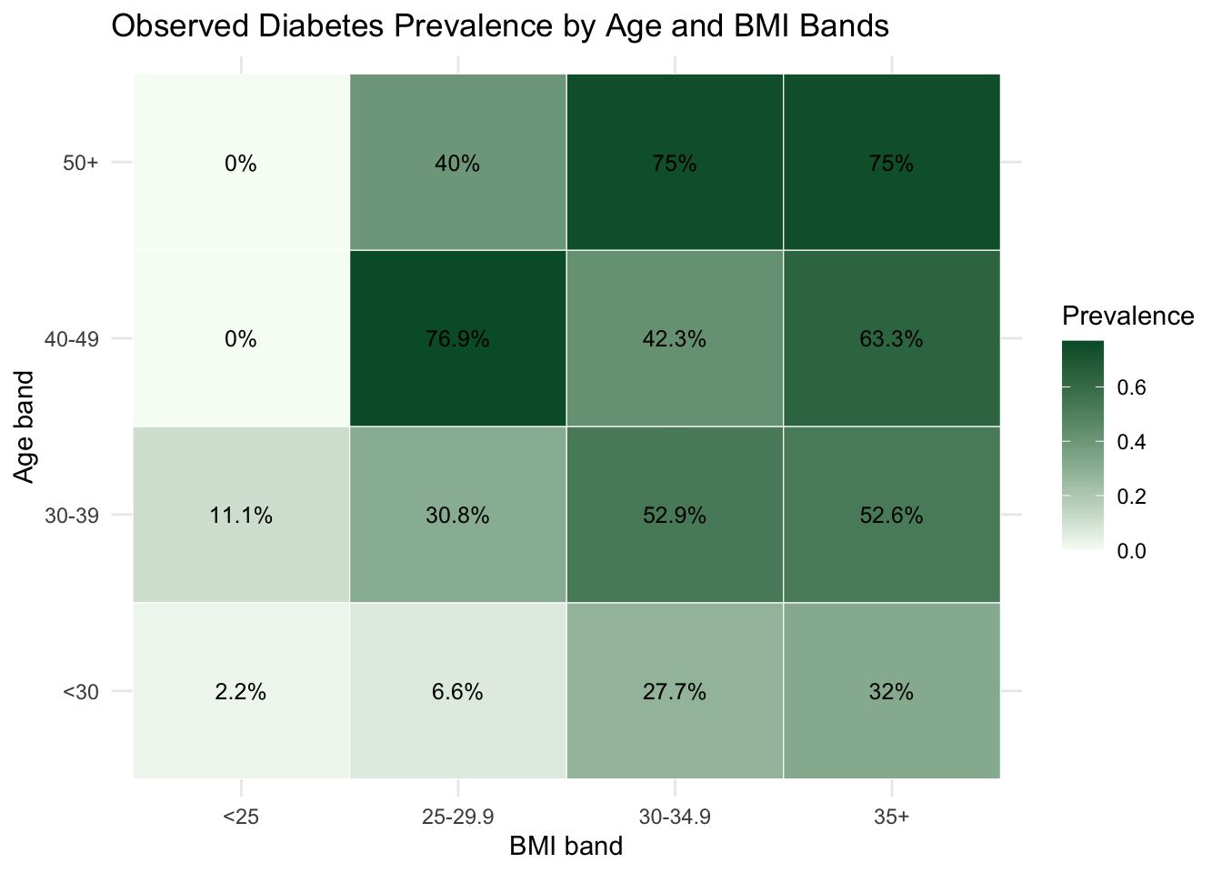
  1. How does diabetes prevalence vary across key demographic and clinical strata?
  2. How can an interactive Shiny interface support rapid epidemiological exploration?
  3. What do partial dependence and Shapley-based summaries reveal about model behavior?
  4. How can we communicate these findings clearly to non-technical stakeholders?

20.3 Data Assembly and Baseline Epidemiological Profile

We merge the training and test partitions into one analysis table, then create a binary indicator used in prevalence calculations.

data(Pima.tr, package = "MASS")
data(Pima.te, package = "MASS")

health_data <- bind_rows(Pima.tr, Pima.te) |>
    mutate(
        type = factor(type, levels = c("No", "Yes")),
        diabetes = ifelse(type == "Yes", 1, 0)
    )

nrow(health_data)
[1] 532
health_overview <- health_data |>
    summarise(
        n = n(),
        diabetes_prevalence = mean(diabetes),
        mean_glu = mean(glu),
        mean_bmi = mean(bmi),
        mean_age = mean(age)
    )

health_overview |>
    gt() |>
    cols_label(
        n = "Sample size",
        diabetes_prevalence = "Diabetes prevalence",
        mean_glu = "Mean glucose",
        mean_bmi = "Mean BMI",
        mean_age = "Mean age"
    ) |>
    fmt_percent(columns = diabetes_prevalence, decimals = 1) |>
    fmt_number(columns = c(mean_glu, mean_bmi, mean_age), decimals = 2)
Sample size Diabetes prevalence Mean glucose Mean BMI Mean age
532 33.3% 121.03 32.89 31.61

To establish epidemiological context, we examine prevalence jointly by age and BMI bands.

epi_grid <- health_data |>
    mutate(
        age_band = cut(
            age,
            breaks = c(-Inf, 30, 40, 50, Inf),
            labels = c("<30", "30-39", "40-49", "50+"),
            right = FALSE
        ),
        bmi_band = cut(
            bmi,
            breaks = c(-Inf, 25, 30, 35, Inf),
            labels = c("<25", "25-29.9", "30-34.9", "35+"),
            right = FALSE
        )
    ) |>
    group_by(age_band, bmi_band) |>
    summarise(
        n = n(),
        prevalence = mean(diabetes),
        .groups = "drop"
    )

epi_grid |>
    ggplot(aes(x = bmi_band, y = age_band, fill = prevalence)) +
    geom_tile(color = "white") +
    geom_text(aes(label = paste0(round(100 * prevalence, 1), "%")), size = 3.3) +
    scale_fill_gradient(low = "#f7fcf5", high = "#005a32") +
    labs(
        title = "Observed Diabetes Prevalence by Age and BMI Bands",
        x = "BMI band",
        y = "Age band",
        fill = "Prevalence"
    ) +
    theme_minimal()

This baseline view highlights heterogeneity that motivates the interactive and model-based steps that follow.

20.4 Interactive Exploration with a Shiny Workflow

As established in Chapter 7 and Chapter 8, interactive tools transform association analysis from a static snapshot into a dynamic conversation with data. Rather than each new question requiring code modification and recomputation, a Shiny interface allows filtering by subgroup, switching indicators, and adjusting parameters in real time. This iterative workflow is particularly valuable in public health settings, where the relevant question often shifts depending on which stratum or indicator the analyst focuses on.

The core Shiny architecture for a health indicator explorer follows the same reactive pattern developed in Chapter 7: a UI with controls for indicator selection and optional subgroup filtering, and a server that recomputes and re-renders plots reactively whenever an input changes.

library(shiny)

# Minimal structure of the health indicator explorer
ui <- fluidPage(
    titlePanel("Public Health Indicator Explorer"),
    sidebarLayout(
        sidebarPanel(
            selectInput(
                inputId  = "indicator",
                label    = "Select indicator",
                choices  = c("glu", "bp", "skin", "bmi", "ped", "age", "npreg"),
                selected = "glu"
            ),
            checkboxGroupInput(
                inputId  = "diabetes_filter",
                label    = "Diabetes status",
                choices  = c("No", "Yes"),
                selected = c("No", "Yes")
            )
        ),
        mainPanel(
            plotOutput("distribution_plot"),
            plotOutput("comparison_plot")
        )
    )
)

server <- function(input, output) {
    # Reactive subset: updates whenever indicator or filter changes
    filtered_data <- reactive({
        health_data |>
            filter(as.character(type) %in% input$diabetes_filter)
    })

    output$distribution_plot <- renderPlot({
        filtered_data() |>
            ggplot(aes(x = .data[[input$indicator]], fill = type)) +
            geom_histogram(alpha = 0.55, position = "identity", bins = 25) +
            labs(x = input$indicator, y = "Count", fill = "Diabetes") +
            theme_minimal()
    })

    output$comparison_plot <- renderPlot({
        filtered_data() |>
            ggplot(aes(x = type, y = .data[[input$indicator]], fill = type)) +
            geom_boxplot(alpha = 0.7, width = 0.55) +
            labs(x = "Diabetes status", y = input$indicator) +
            theme_minimal() +
            theme(legend.position = "none")
    })
}

The reactive expression filtered_data() is the organizing principle: both plots depend on it, so changing either the indicator or the diabetes filter triggers a single re-evaluation of the subset and automatic re-rendering of all downstream outputs. This is the same reactive dependency graph pattern introduced in Chapter 7.

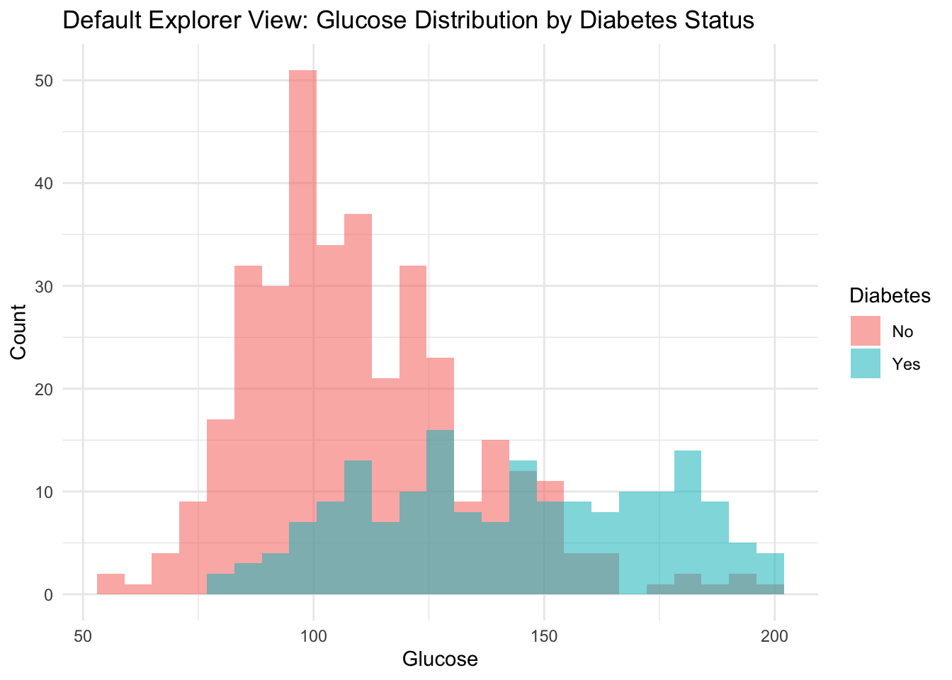
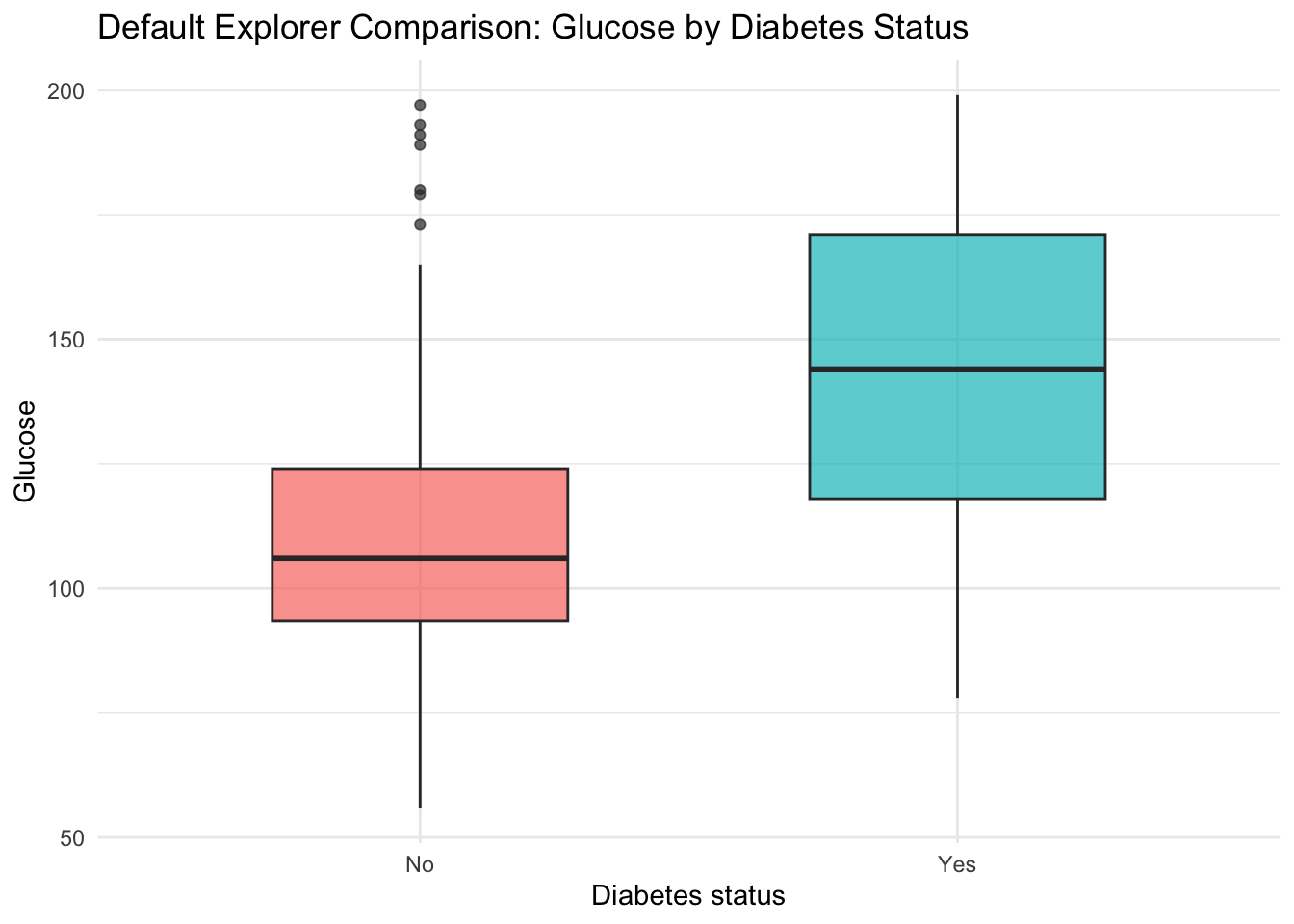
We now show a static default view equivalent to one state of the live app, then embed the deployed application.

default_indicator <- "glu"

health_data |>
    ggplot(aes(x = .data[[default_indicator]], fill = type)) +
    geom_histogram(alpha = 0.55, position = "identity", bins = 25) +
    labs(
        title = "Default Explorer View: Glucose Distribution by Diabetes Status",
        x = "Glucose",
        y = "Count",
        fill = "Diabetes"
    ) +
    theme_minimal()

health_data |>
    ggplot(aes(x = type, y = glu, fill = type)) +
    geom_boxplot(alpha = 0.7, width = 0.55) +
    labs(
        title = "Default Explorer Comparison: Glucose by Diabetes Status",
        x = "Diabetes status",
        y = "Glucose",
        fill = "Diabetes"
    ) +
    theme_minimal() +
    theme(legend.position = "none")

The full source code of the application is available on GitHub.

This app-level workflow is useful when we want rapid subgroup checks before committing to a fixed modeling specification. The interactive layer also supports communication with non-technical stakeholders, who can explore the data themselves without reading code, aligning with the communication principles developed in Chapter 9.

20.5 Interpretable Model for Descriptive Risk Mapping

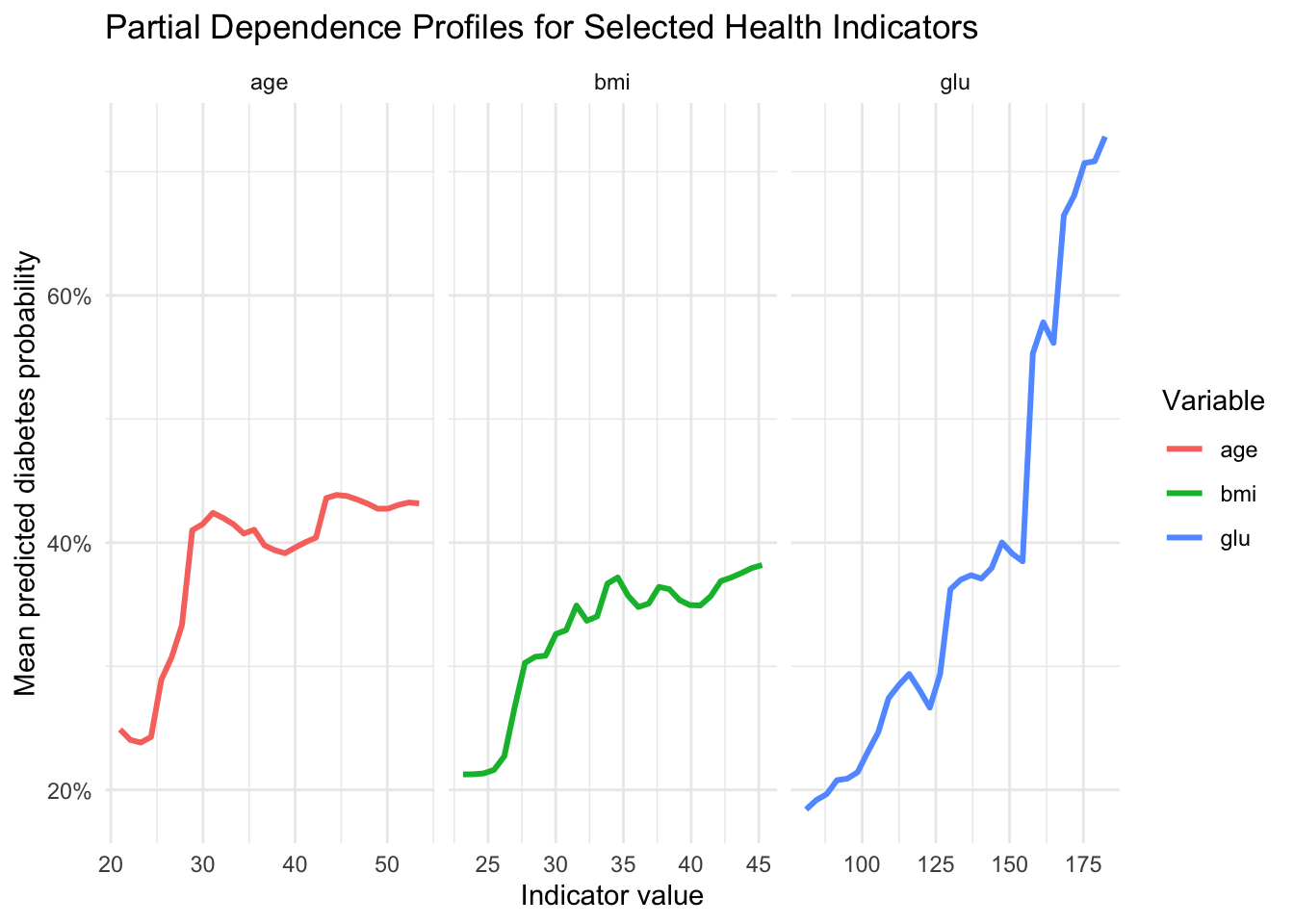
We now fit a random forest classifier to obtain smooth probability estimates and then interpret those estimates with partial dependence and Shapley-based summaries. The objective is descriptive mapping of model behavior, not predictive competition.

set.seed(123)
idx_train <- sample(seq_len(nrow(health_data)), size = 0.7 * nrow(health_data))

train_health <- health_data[idx_train, ]
test_health <- health_data[-idx_train, ]

health_formula <- type ~ npreg + glu + bp + skin + bmi + ped + age

rf_health <- randomForest(
    formula = health_formula,
    data = train_health,
    ntree = 600,
    mtry = 3,
    importance = TRUE
)

predict_prob <- function(model, newdata) {
    as.numeric(predict(model, newdata = newdata, type = "prob")[, "Yes"])
}

test_pred_prob <- predict_prob(rf_health, test_health)
test_pred_class <- factor(
    ifelse(test_pred_prob >= 0.5, "Yes", "No"),
    levels = levels(test_health$type)
)

accuracy <- mean(test_pred_class == test_health$type)
brier <- mean((test_health$diabetes - test_pred_prob)^2)

tibble::tibble(
    metric = c("Holdout accuracy", "Holdout Brier score", "Observed prevalence", "Mean predicted probability"),
    value = c(
        accuracy,
        brier,
        mean(test_health$diabetes),
        mean(test_pred_prob)
    )
) |>
    gt() |>
    cols_label(metric = "Metric", value = "Value") |>
    fmt_number(columns = value, decimals = 3)
Metric Value
Holdout accuracy 0.800
Holdout Brier score 0.141
Observed prevalence 0.356
Mean predicted probability 0.335
conf_mat <- table(Observed = test_health$type, Predicted = test_pred_class)

conf_mat |>
    as.data.frame.matrix() |>
    tibble::rownames_to_column(var = "Observed") |>
    gt()
Observed No Yes
No 91 12
Yes 20 37

20.6 Partial Dependence Profiles

To study global model behavior, we compute partial dependence curves for glucose, BMI, and age. These are average model responses over a grid of values while integrating over the empirical distribution of other features.

partial_dependence_prob <- function(model, data, variable, grid_size = 30) {
    grid <- seq(
        as.numeric(quantile(data[[variable]], 0.05)),
        as.numeric(quantile(data[[variable]], 0.95)),
        length.out = grid_size
    )

    pd_rows <- lapply(grid, function(v) {
        data_mod <- data
        data_mod[[variable]] <- v
        tibble::tibble(
            value = v,
            mean_pred_prob = mean(predict_prob(model, data_mod))
        )
    })

    bind_rows(pd_rows) |>
        mutate(variable = variable)
}

pd_tbl <- bind_rows(
    partial_dependence_prob(rf_health, train_health, "glu"),
    partial_dependence_prob(rf_health, train_health, "bmi"),
    partial_dependence_prob(rf_health, train_health, "age")
)

pd_tbl |>
    ggplot(aes(x = value, y = mean_pred_prob, color = variable)) +
    geom_line(linewidth = 1.05) +
    facet_wrap(~ variable, scales = "free_x") +
    scale_y_continuous(labels = function(x) paste0(round(100 * x), "%")) +
    labs(
        title = "Partial Dependence Profiles for Selected Health Indicators",
        x = "Indicator value",
        y = "Mean predicted diabetes probability",
        color = "Variable"
    ) +
    theme_minimal()

pd_summary_tbl <- pd_tbl |>
    group_by(variable) |>
    summarise(
        pd_low = first(mean_pred_prob),
        pd_high = last(mean_pred_prob),
        pd_change = pd_high - pd_low,
        .groups = "drop"
    ) |>
    arrange(desc(pd_change))

pd_summary_tbl |>
    gt() |>
    cols_label(
        variable = "Variable",
        pd_low = "Predicted probability at low grid value",
        pd_high = "Predicted probability at high grid value",
        pd_change = "Change"
    ) |>
    fmt_percent(columns = c(pd_low, pd_high, pd_change), decimals = 1)
Variable Predicted probability at low grid value Predicted probability at high grid value Change
glu 18.4% 72.8% 54.4%
age 24.9% 43.2% 18.3%
bmi 21.3% 38.2% 16.9%

In a public health framing, these profiles are useful for communicating directional gradients without reducing interpretation to a single coefficient.

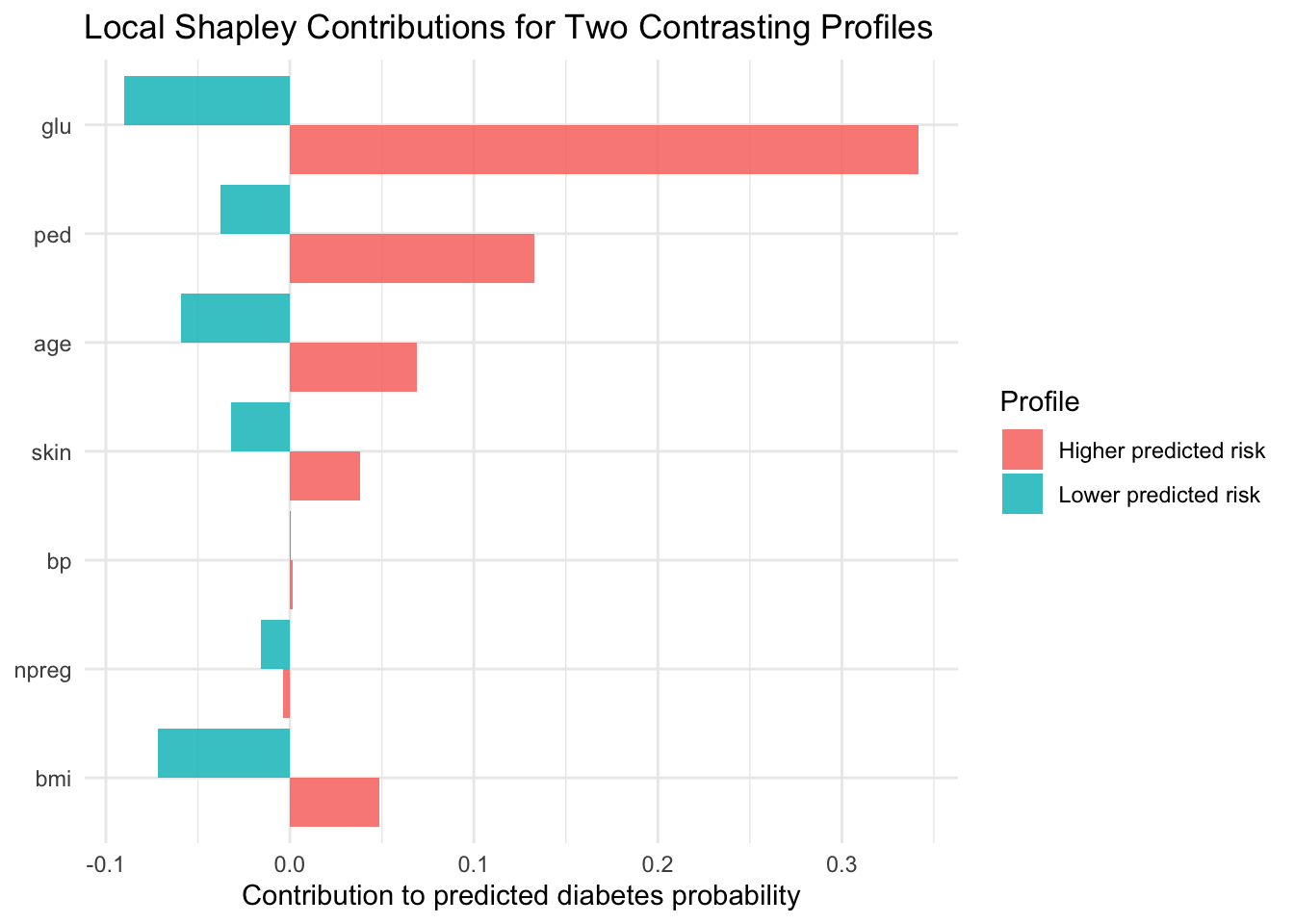
20.7 Local and Global Shapley-Based Explanations

Partial dependence provides global structure. We complement it with local additive decomposition, following the logic introduced in the chapter on Shapley values (Chapter 16).

shapley_single_mc_prob <- function(model,
                                  x_row,
                                  background,
                                  features,
                                  n_permutations = 300,
                                  seed = 123) {
    set.seed(seed)
    contributions <- setNames(rep(0, length(features)), features)

    for (b in seq_len(n_permutations)) {
        perm <- sample(features)
        z <- background[sample(seq_len(nrow(background)), 1), features, drop = FALSE]

        current <- z
        pred_prev <- predict_prob(model, current)

        for (f in perm) {
            current[[f]] <- x_row[[f]]
            pred_new <- predict_prob(model, current)
            contributions[f] <- contributions[f] + (pred_new - pred_prev)
            pred_prev <- pred_new
        }
    }

    contributions / n_permutations
}

feature_set <- c("npreg", "glu", "bp", "skin", "bmi", "ped", "age")
background <- train_health[, feature_set, drop = FALSE]

test_scored <- test_health |>
    mutate(pred_prob = test_pred_prob)

idx_higher <- which.max(test_scored$pred_prob)
idx_lower <- which.min(test_scored$pred_prob)

phi_higher <- shapley_single_mc_prob(
    model = rf_health,
    x_row = test_scored[idx_higher, feature_set, drop = FALSE],
    background = background,
    features = feature_set,
    n_permutations = 350,
    seed = 1001
)

phi_lower <- shapley_single_mc_prob(
    model = rf_health,
    x_row = test_scored[idx_lower, feature_set, drop = FALSE],
    background = background,
    features = feature_set,
    n_permutations = 350,
    seed = 1002
)

baseline_prob <- mean(predict_prob(rf_health, background))

local_accuracy_tbl <- tibble::tibble(
    profile = c("Higher predicted risk profile", "Lower predicted risk profile"),
    prediction = c(test_scored$pred_prob[idx_higher], test_scored$pred_prob[idx_lower]),
    baseline_plus_shap = c(
        baseline_prob + sum(phi_higher),
        baseline_prob + sum(phi_lower)
    ),
    difference = prediction - baseline_plus_shap
)

local_accuracy_tbl |>
    gt() |>
    cols_label(
        profile = "Profile",
        prediction = "Predicted probability",
        baseline_plus_shap = "Baseline + sum(Shapley)",
        difference = "Difference"
    ) |>
    fmt_percent(columns = c(prediction, baseline_plus_shap, difference), decimals = 2)
Profile Predicted probability Baseline + sum(Shapley) Difference
Higher predicted risk profile 94.83% 95.06% −0.23%
Lower predicted risk profile 0.00% 1.71% −1.71%
local_shap_tbl <- tibble::tibble(
    feature = feature_set,
    higher_profile = as.numeric(phi_higher[feature_set]),
    lower_profile = as.numeric(phi_lower[feature_set])
) |>
    pivot_longer(
        cols = c(higher_profile, lower_profile),
        names_to = "profile",
        values_to = "contribution"
    ) |>
    mutate(
        profile = recode(
            profile,
            higher_profile = "Higher predicted risk",
            lower_profile = "Lower predicted risk"
        )
    )

local_shap_tbl |>
    ggplot(aes(x = reorder(feature, contribution), y = contribution, fill = profile)) +
    geom_col(position = "dodge", alpha = 0.85) +
    coord_flip() +
    labs(
        title = "Local Shapley Contributions for Two Contrasting Profiles",
        x = NULL,
        y = "Contribution to predicted diabetes probability",
        fill = "Profile"
    ) +
    theme_minimal()

For a global relevance view, we estimate mean absolute Shapley contributions on a subset of holdout observations.

set.seed(456)
ids_explain <- sample(seq_len(nrow(test_health)), size = min(40, nrow(test_health)))

shap_many <- lapply(seq_along(ids_explain), function(k) {
    i <- ids_explain[k]
    phi_i <- shapley_single_mc_prob(
        model = rf_health,
        x_row = test_health[i, feature_set, drop = FALSE],
        background = background,
        features = feature_set,
        n_permutations = 150,
        seed = 500 + k
    )
    as.data.frame(as.list(phi_i))
})

shap_many_df <- bind_rows(shap_many)

global_shap_tbl <- tibble::tibble(
    feature = feature_set,
    mean_abs_shap = sapply(feature_set, function(v) mean(abs(shap_many_df[[v]])))
) |>
    arrange(desc(mean_abs_shap))

global_shap_tbl |>
    gt() |>
    cols_label(
        feature = "Feature",
        mean_abs_shap = "Mean absolute Shapley contribution"
    ) |>
    fmt_percent(columns = mean_abs_shap, decimals = 2)
Feature Mean absolute Shapley contribution
glu 10.68%
age 6.97%
bmi 4.80%
ped 4.41%
npreg 3.14%
skin 3.04%
bp 1.38%

20.8 Communicating Results to Non-Technical Stakeholders

In line with the communication principles developed earlier in the book, we translate model outputs into message-oriented summaries.

First, we create risk bands from holdout predicted probabilities and compare them with observed outcome frequencies.

risk_band_tbl <- test_scored |>
    mutate(
        risk_band = cut(
            pred_prob,
            breaks = c(-Inf, 0.20, 0.40, 0.60, Inf),
            labels = c("<=0.20", "0.20-0.40", "0.40-0.60", ">0.60")
        )
    ) |>
    group_by(risk_band) |>
    summarise(
        n = n(),
        observed_prevalence = mean(diabetes),
        mean_glucose = mean(glu),
        mean_bmi = mean(bmi),
        .groups = "drop"
    )

risk_band_tbl |>
    gt() |>
    cols_label(
        risk_band = "Predicted risk band",
        n = "N",
        observed_prevalence = "Observed diabetes prevalence",
        mean_glucose = "Mean glucose",
        mean_bmi = "Mean BMI"
    ) |>
    fmt_percent(columns = observed_prevalence, decimals = 1) |>
    fmt_number(columns = c(mean_glucose, mean_bmi), decimals = 2)
Predicted risk band N Observed diabetes prevalence Mean glucose Mean BMI
<=0.20 66 7.6% 98.80 29.03
0.20-0.40 34 23.5% 113.47 32.26
0.40-0.60 27 63.0% 134.44 36.19
>0.60 33 81.8% 161.18 37.25
risk_band_tbl |>
    ggplot(aes(x = risk_band, y = observed_prevalence)) +
    geom_col(fill = "indianred3", alpha = 0.85) +
    scale_y_continuous(labels = function(x) paste0(round(100 * x), "%")) +
    labs(
        title = "Observed Prevalence Across Predicted Risk Bands",
        x = "Predicted risk band",
        y = "Observed diabetes prevalence"
    ) +
    theme_minimal()

Second, we summarize the analytical narrative in a message-evidence format that can be reused in technical briefs or public health dashboards.

Message 1. Higher glucose values are associated with higher model-estimated diabetes probability. The supporting evidence is that the partial dependence profile for glucose shows the largest increase from low to high values.

Message 2. BMI and age contribute to substantial between-profile risk heterogeneity. The supporting evidence is that Shapley summaries indicate meaningful local and global contributions from BMI and age.

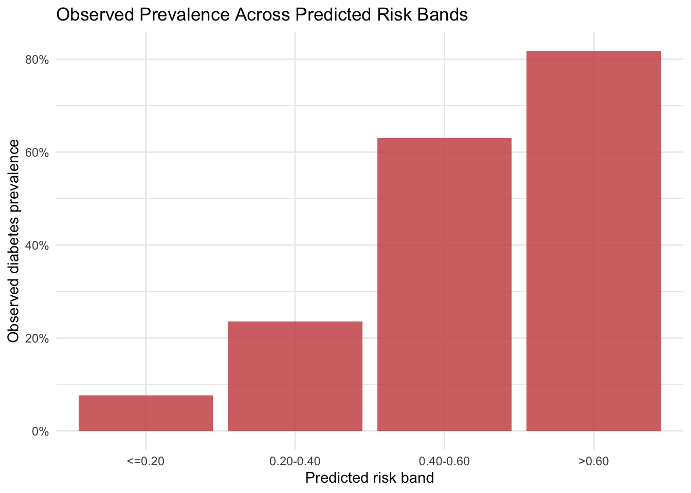
Message 3. Predicted risk strata correspond to increasing observed prevalence in holdout data. The supportifng evidence is that observed prevalence increases across ordered predicted-probability bands.

20.9 Limitations and Reproducibility Notes

Three considerations remain central.

  1. The analysis is observational and descriptive, so interpretation should avoid causal claims.
  2. The sample is specific and relatively compact, which limits transportability.
  3. Shapley approximations are Monte Carlo estimates, so small contributions can vary with sampling settings.

All random components use explicit seeds. In practice, it is often useful to check sensitivity across additional resamples and alternative model classes.

20.10 Summary and Key Takeaways

  • Interactive Shiny exploration helps identify stable subgroup patterns before model fitting.
  • Partial dependence provides a clear global view of predictor-response gradients.
  • Shapley-based decomposition complements global profiles with case-level interpretation.
  • Risk-band summaries and message-evidence tables support communication with non-technical audiences.
  • The full workflow remains descriptive and should be communicated with corresponding caution.

20.11 Looking Ahead

This chapter centered on interactive exploration and interpretable machine learning in a public health context. The next case study shifts to business analytics, where AutoML and automated feature engineering will be used as descriptive instruments for customer insight generation.