19Case Study: Public Policy and Program Evaluation
19.1 Introduction: Bringing the Toolkit Together in a Policy Setting
Across the previous chapters, we developed a broad descriptive toolkit for tabular data, from type-aware association measures and network representations to tree-based segmentation, ensemble summaries, and communication principles. This case study is an opportunity to use those components together in an end-to-end policy workflow.
Our aim is modest and practical. We study county-level socioeconomic indicators to understand how structural characteristics co-occur with poverty rates, and how descriptive patterns can support policy interpretation and program design. We focus on transparent summaries and segmentation rules, while keeping a clear distinction between predictive description and causal evaluation.
19.2 Policy Context and Analytical Objective
We use the midwest dataset from ggplot2, which contains county-level demographic and socioeconomic variables for U.S. Midwest states. Although this is not a program trial dataset, it reflects the kinds of administrative and survey indicators that often appear in policy analysis.
For this chapter, we treat percbelowpoverty (percent of individuals below the poverty threshold) as a policy-relevant outcome proxy. We ask three connected descriptive questions:
Which variables show the strongest association with county poverty rates, in a mixed-type setting?
How those associations organize into a multivariate network structure?
Which interpretable county segments emerge from recursive partitioning?
These questions align with exploratory policy work where the immediate goal is targeting, profiling, and communication, not effect identification.
19.3 Data Preparation and Initial Profiling
We create a compact analysis table with both continuous and categorical variables. The mix of variable types lets us reuse the unified association logic introduced earlier in the book.
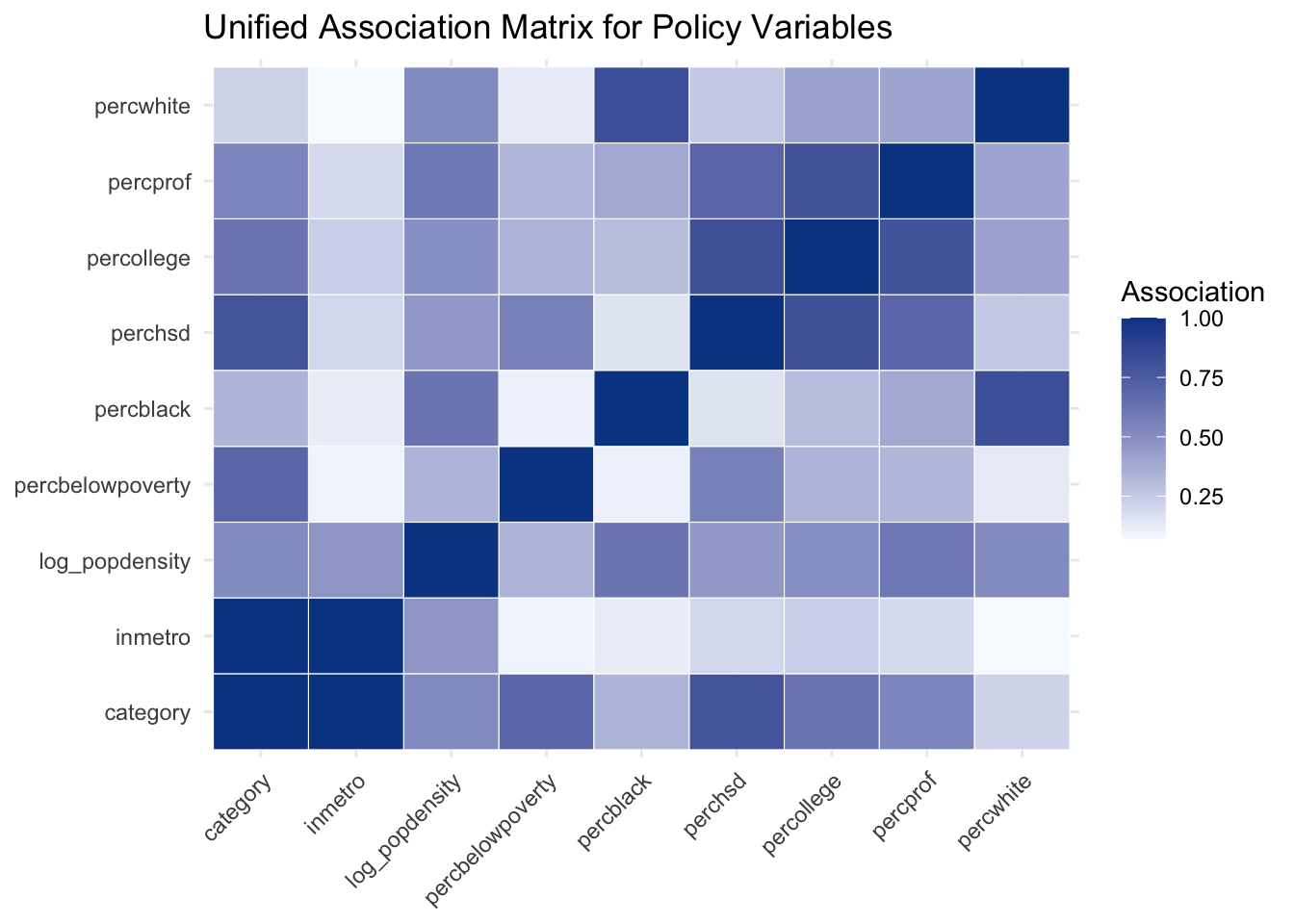
assoc_plot_data <-as.data.frame(as.table(assoc_mat), stringsAsFactors =FALSE) |>rename(var1 = Var1, var2 = Var2, association = Freq)assoc_plot_data |>ggplot(aes(x = var1, y = var2, fill = association)) +geom_tile(color ="white") +scale_fill_gradient(low ="#f7fbff", high ="#084594") +labs(title ="Unified Association Matrix for Policy Variables",x =NULL,y =NULL,fill ="Association" ) +theme_minimal() +theme(axis.text.x =element_text(angle =45, hjust =1))
Even in this compact analysis set, we can identify association blocks related to education, occupational structure, and racial composition. This pairwise view is informative, and the network representation helps us see the same structure at a systems level.
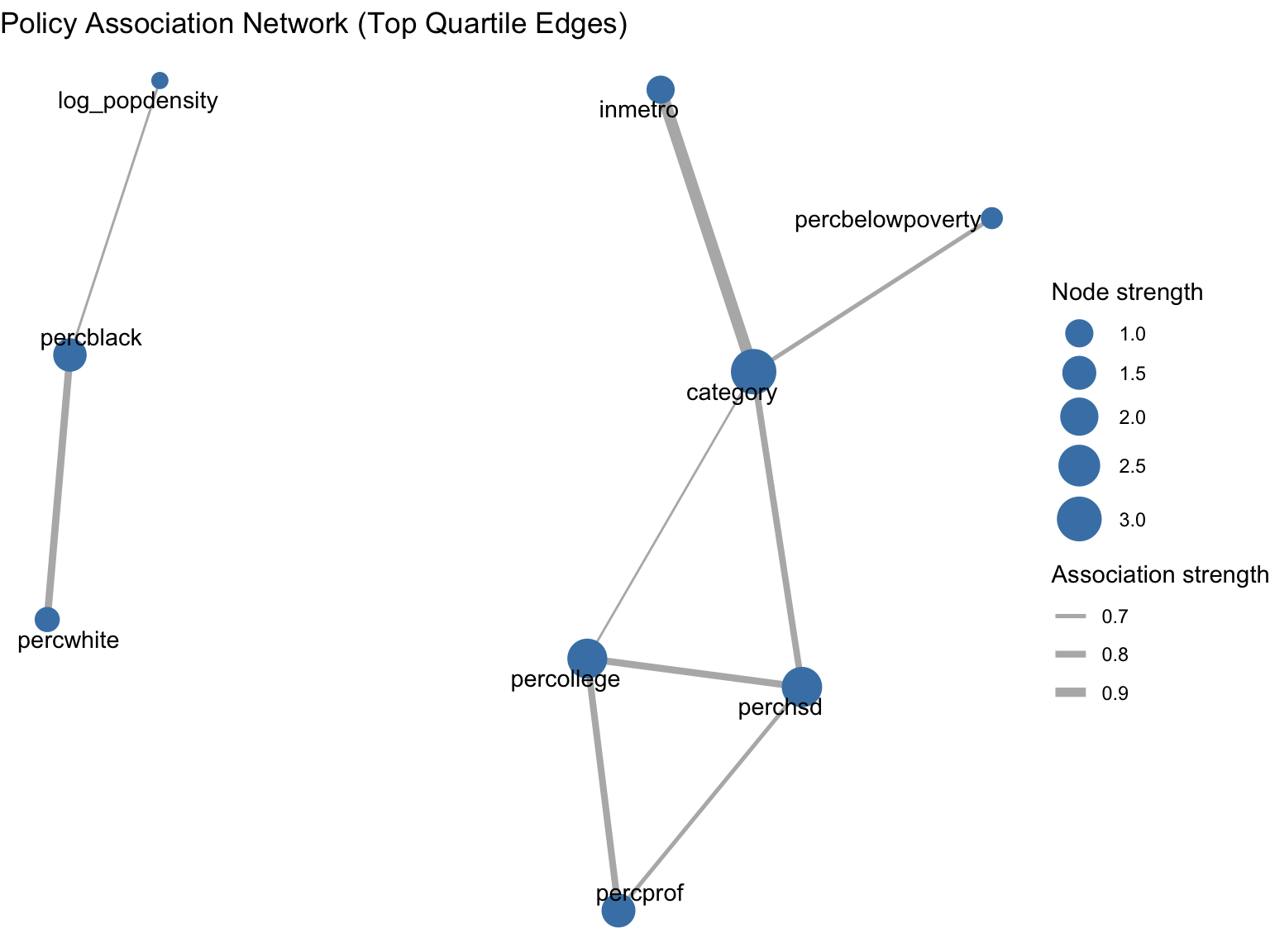
19.5 Network Representation of the Association Structure
To avoid a fully dense graph, we retain only associations above the 75th percentile of off-diagonal association strengths. The resulting graph highlights the strongest links while preserving weighted edge information.
The network view supports a policy-oriented reading: variables that are central in this graph are those that connect multiple structural dimensions simultaneously. This can help prioritize which indicators are monitored together in reporting dashboards.
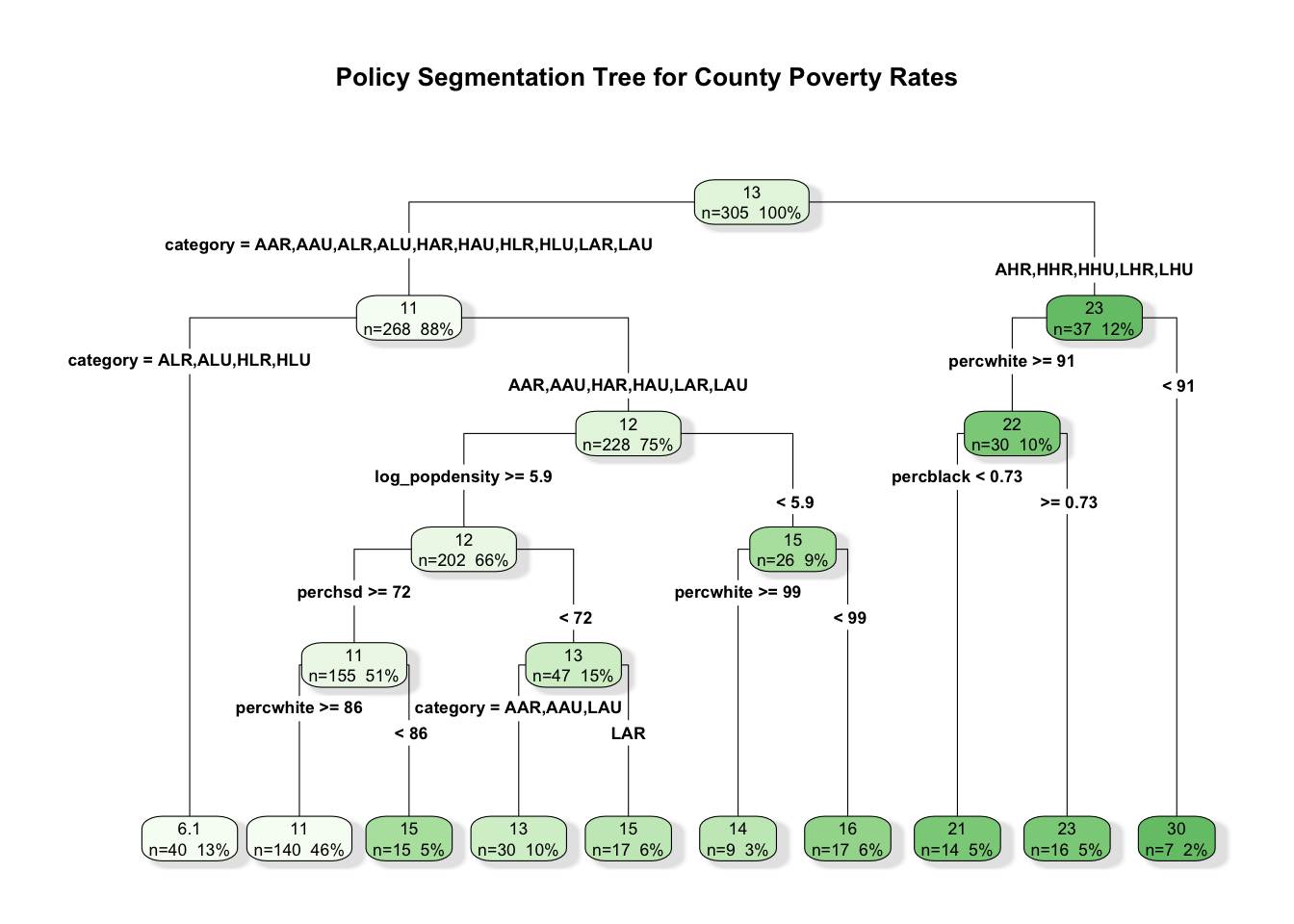
19.6 Tree-Based Segmentation of County Contexts
Pairwise and network summaries describe structure globally. We now turn to segmentation, using a regression tree to partition counties into interpretable groups with different average poverty rates.
rpart.plot( pruned_tree,type =4,extra =101,fallen.leaves =TRUE,box.palette ="Greens",branch.lty =1,shadow.col ="gray90",main ="Policy Segmentation Tree for County Poverty Rates")
To keep the segmentation grounded, we compare out-of-sample RMSE for the pruned tree and a random forest fit on the same training split. The goal is not model competition, but a calibration check for segmentation stability.
The tree remains our primary segmentation tool because it yields explicit rules. The ensemble result helps us gauge whether the tree captures a substantial part of the descriptive signal.
19.7 Segment Profiles and Policy Interpretation
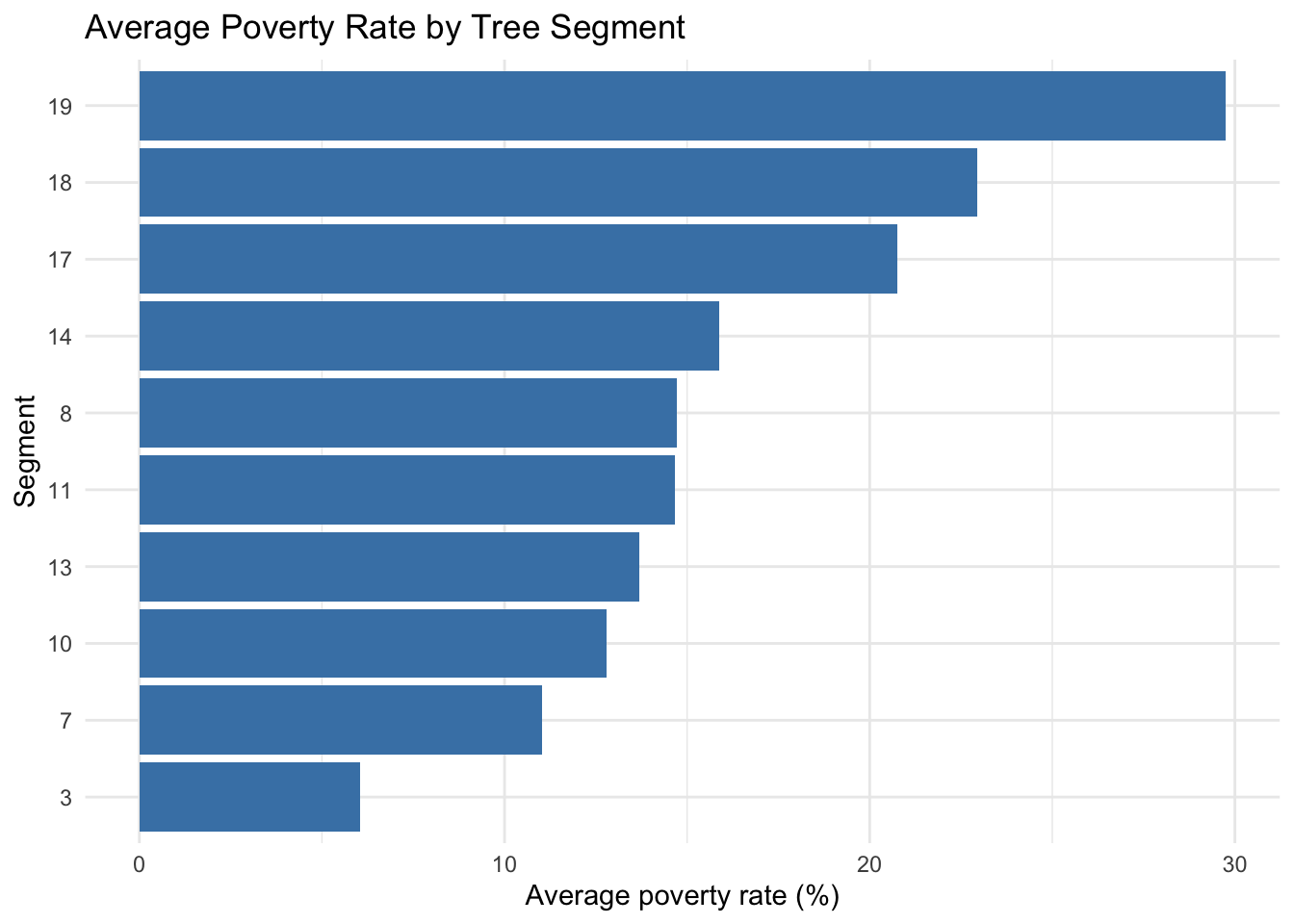
We summarize the leaves of the pruned tree on the training sample. The resulting profiles can support differentiated policy interpretation, for example by identifying segments where poverty is jointly associated with education and labor-market composition indicators.
segment_tbl |>ggplot(aes(x =reorder(leaf, mean_poverty), y = mean_poverty)) +geom_col(fill ="steelblue") +coord_flip() +labs(title ="Average Poverty Rate by Tree Segment",x ="Segment",y ="Average poverty rate (%)" ) +theme_minimal()
In policy settings, this kind of segmentation can help organize discussion around differentiated contexts rather than one average county profile. It can also support resource allocation conversations when combined with program costs and feasibility constraints.
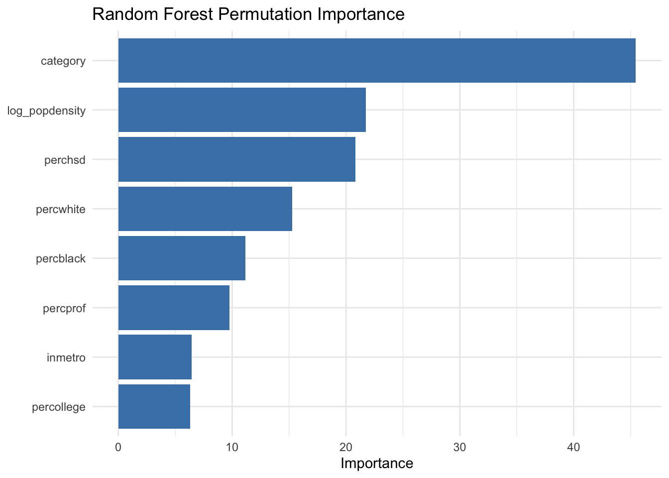
19.8 Ensemble-Based Variable Stability Check
As discussed in the ensemble chapter (Chapter 12), variable importance from random forests can complement tree rules by indicating which predictors consistently contribute across many bootstrap samples.
When tree split variables and ensemble importance rankings point in similar directions, policy interpretation can be communicated with greater confidence. When they differ, that difference itself is informative and may suggest interaction effects or near-substitute predictors.
19.9 Communicating Descriptive Findings in Policy Work
This workflow supports several practical communication outputs:
a concise association ranking that clarifies which indicators move together,
a network map that highlights structurally central indicators,
a segment table that turns model structure into county profiles,
an ensemble stability check to contextualize split-based conclusions.
For non-technical stakeholders, these outputs are often easier to discuss than raw model objects. At the same time, careful wording remains important. We describe patterns in observed data and model behavior, while avoiding causal language unless a separate identification strategy is in place.
19.10 Limitations and Reproducibility Notes
Three limits are worth keeping in view.
This is an observational dataset, so the analysis supports descriptive interpretation, not causal attribution.
County-level indicators aggregate heterogeneous populations, which can mask within-county variation.
Segmentation rules are sample-dependent, so stability checks and sensitivity analyses are useful in applied work.
For reproducibility, all random components in this chapter use explicit seeds. In practice, it is often helpful to report sensitivity across several seeds and threshold choices.
19.11 Summary and Key Takeaways
Mixed-type association measures provide a coherent starting point for policy tabular data.
Network representations help prioritize variables that connect multiple structural domains.
Regression trees translate multivariate structure into interpretable county segments.
Ensemble importance can be used as a stability lens for segmentation narratives.
Descriptive findings are most useful when presented as context for policy deliberation, not as definitive causal evidence.
19.12 Looking Ahead
This policy case study emphasized association structure, networks, and segmentation in administrative-style tabular data. The next case study shifts to public health and epidemiological analysis, where interactive exploration and interpretable machine learning will play a more central role in communicating results to broad stakeholder groups.
David, F. N., and H. Cramer. 1947. “Mathematical Methods of Statistics.”Biometrika 34 (3/4): 374. https://doi.org/10.2307/2332454.
Fisher, Sir Ronald A. 1990. “Statistical Methods for Research Workers.”Statistical Methods, Experimental Design, and Scientific Inference. Oxford University PressOxford. https://doi.org/10.1093/oso/9780198522294.002.0003.
Spearman, C. 1961. “The Proof and Measurement of Association Between Two Things.” In Studies in Individual Differences: The Search for Intelligence., 45–58. Appleton-Century-Crofts. https://doi.org/10.1037/11491-005.