library(shiny)
runGitHub("AssociationExplorer", "AntoineSoetewey")8 The AssociationExplorer Application
8.1 Introduction: From Principles to Practice
The previous chapter suggested that interactive tools can transform association analysis from static snapshots into dynamic exploration. We learned:
- How reactive expressions automate dependency tracking
- How UI controls enable parameter adjustment without code modification
- How multiple linked views facilitate pattern discovery
- How performance patterns keep interactions instantaneous
We now demonstrate these principles in practice through AssociationExplorer, a production-ready Shiny application designed for exploratory association analysis (Soetewey et al. 2026). Rather than building toy examples, we examine a complete, deployed application that serves real users: journalists analyzing survey data, educators explaining correlation structures to students, and researchers discovering patterns in complex multivariate datasets.
8.1.1 How to Open the App
You can launch AssociationExplorer directly from GitHub:
Or via the CRAN package:
library(AssociationExplorer2)
run_associationexplorer()
8.2 Design Philosophy
8.2.1 Who Is AssociationExplorer For?
AssociationExplorer targets non-technical practitioners who need to explore associations but lack advanced statistical or programming expertise. This design choice shapes many architectural decisions:
Automatic variable type detection: Users need not specify whether variables are quantitative or qualitative; the app infers types and applies appropriate association measures.
Sensible defaults: The first time a user loads the app, they encounter preselected thresholds and clear navigation without overwhelming options.
Minimal statistical jargon: Labels like “Correlation Network” replace “Directed Acyclic Graphs.” Help text defines technical terms inline.
One-click visualization: Rather than forcing users to write code, a single button produces a publication-ready network plot.
8.2.2 What Problems Does It Solve?
Before interactive tools, analysts asking “What associations exist in this dataset?” faced three sub-questions:
- Which associations matter? Compute pairwise measures for all variables, then manually filter by strength.
- How do they interconnect? Draw a network by hand or spend hours in visualization software.
- Do I trust the pattern? Validate by hand-checking individual variable pairs.
AssociationExplorer streamlines this workflow into: upload data → adjust sliders → explore. The app automatically handles:
- Heterogeneous variable types (mixing quantitative and categorical variables)
- Missing data (computing pairwise associations only on complete cases)
- Computational efficiency (precomputing expensive operations)
- Visual clarity (automatically arranging network layout)
8.3 Part I: Application Architecture
8.3.1 The Workflow Tabs
AssociationExplorer organizes the analysis pipeline into five sequential tabs, each corresponding to a distinct analytic stage. This structure implements the progressive disclosure principle from Chapter 7: novice users follow tabs in order, while experienced users jump between tabs as needed.
8.3.1.1 Tab 1: Data Upload
Users begin in the Data tab, which handles three core tasks:
- Upload the dataset in CSV or Excel format
- (Optionally) upload variable descriptions for interpretability
- Automatically clean and validate the data
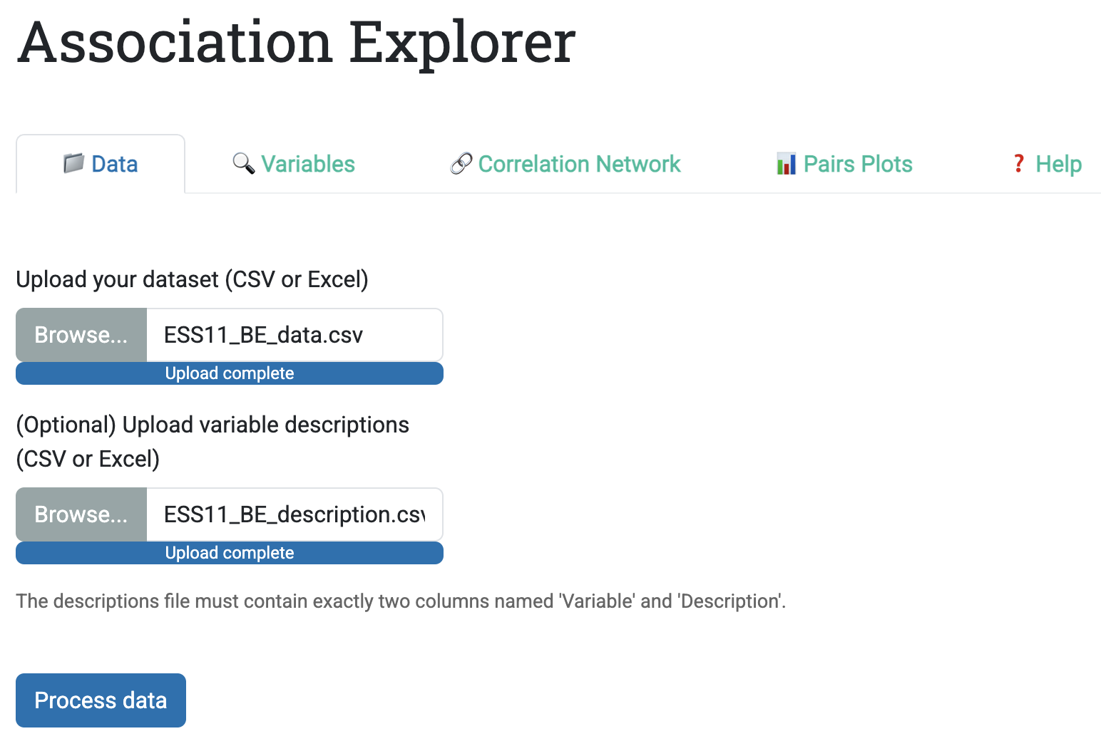
The upload interface is deliberately simple: two file inputs (data + descriptions) and one button (“Process data”). Behind this simplicity sits a set of practical checks:
- CSV files require comma separation and dot decimals (European format support exists but requires explicit note in UI)
- Excel files (.xlsx) are read directly without format specification
- Variables with zero variance (only one unique value) are automatically removed with a warning
- Missing data is preserved, and the app computes pairwise associations only on complete cases
Why this matters: Many data exploration tools struggle with real data because they ignore missing values or crash on degenerate variables. AssociationExplorer anticipates these problems and handles them quietly.
8.3.1.2 Tab 2: Variable Selection
Once data is loaded, the Variables tab allows users to select which variables to analyze. Implementation details matter:
- A multi-select dropdown (not checkboxes) scales to 50+ variables without overwhelming the UI
- Selected variables are retained as defaults, reducing clicks if users make small adjustments
- If a descriptions file was uploaded, a reactive table displays selected variables alongside their descriptions
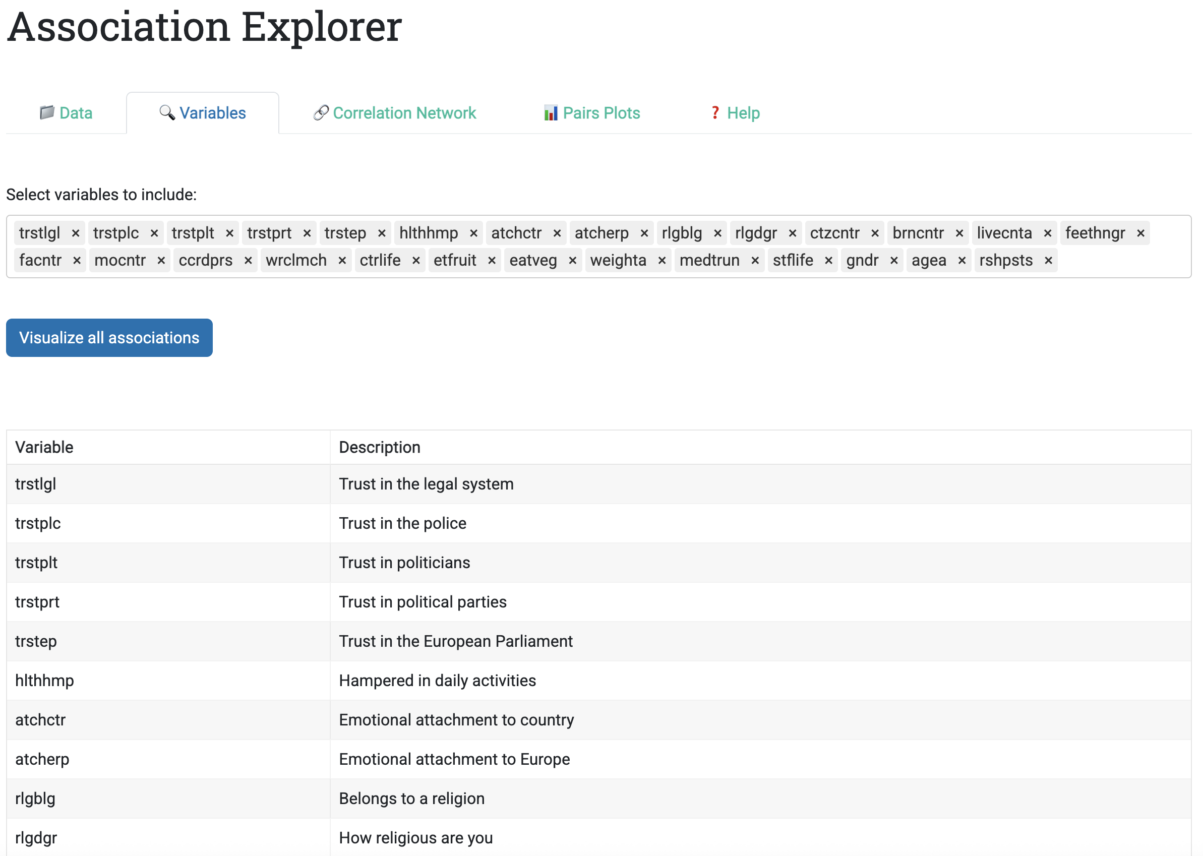
This design supports two common workflows:
- Exploratory: Start with all variables, then iteratively exclude irrelevant ones
- Confirmatory: Select a pre-defined subset of theoretically important variables
8.3.1.3 Tab 3: Correlation Network
The Correlation Network tab is where association patterns become visible. The sidebar contains two key controls:
- Threshold for quantitative-quantitative and quantitative-categorical associations: Filtered by \(R^2\) (the coefficient of determination), ranging 0-1. Default: 0.5.
- Threshold for categorical-categorical associations: Filtered by Cramér’s V, ranging 0-1. Default: 0.5.
Why two thresholds? Because association measures are scale-dependent: Pearson’s \(r\) ranges \([-1, 1]\), Eta ranges \([0, 1]\), and Cramér’s V ranges \([0, 1]\). Setting a single threshold can systematically bias results toward one variable type. AssociationExplorer lets users adjust each threshold independently.
The main panel displays an interactive network visualization built with the visNetwork R package. The visualization encodes association strength in two ways:
- Edge thickness: Stronger associations lead to thicker edges (visual pop-out effect)
- Edge length: Stronger associations lead to shorter edges (physical clustering)
For numeric pairs, edge color conveys direction:
- Blue edges: Positive associations
- Red edges: Negative associations
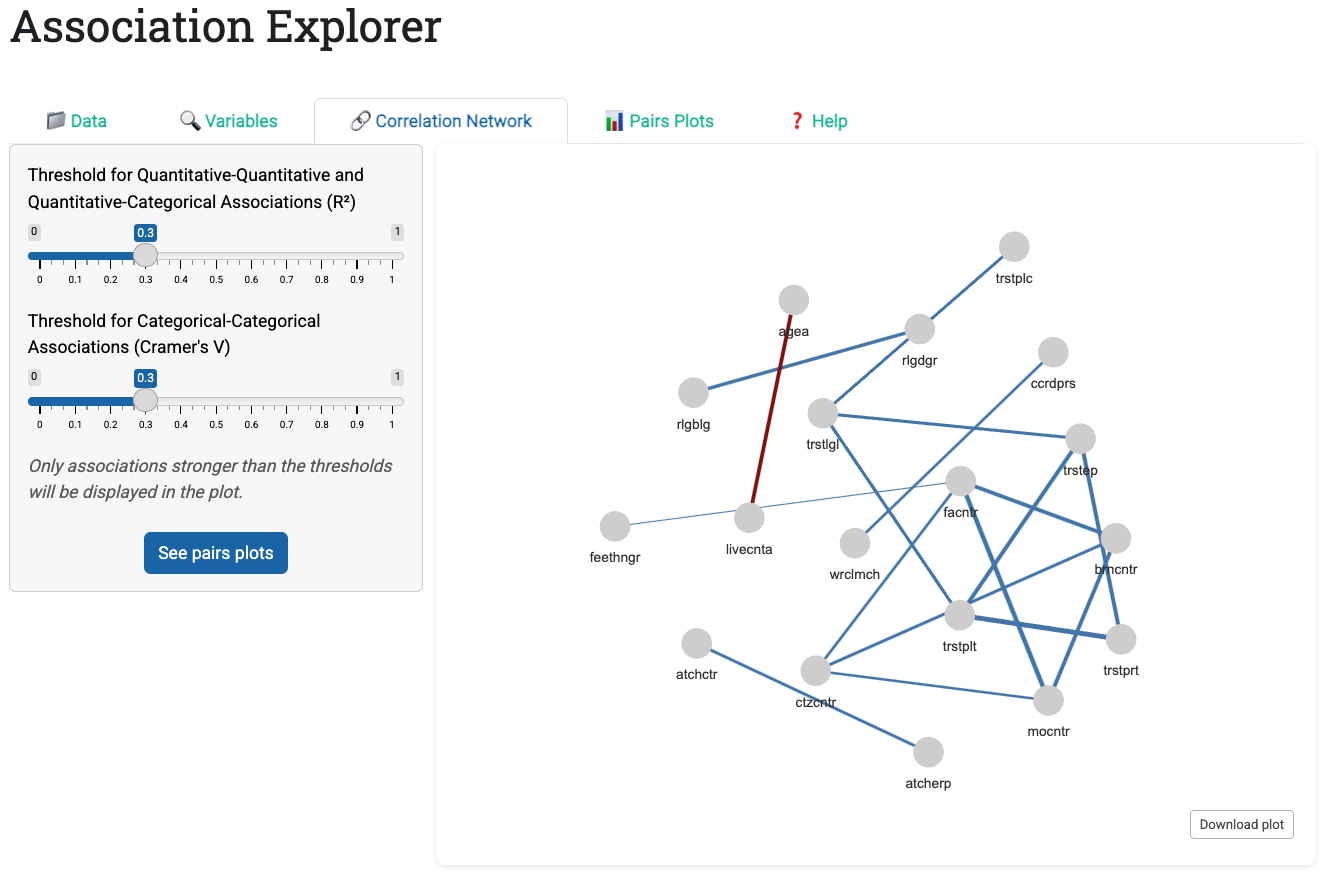
Hovering over a node reveals its full description (if provided in the descriptions file), transforming cryptic variable codes into readable labels.
8.3.1.4 Tab 4: Pairs Plots
Once users identify associations of interest in the network, the Pairs Plots tab displays bivariate visualizations for each association above the thresholds. The app generates three plot types automatically based on variable types:
- Numeric vs. Numeric: Scatter plot with overlaid linear regression line (with jitter to reveal density)
- Numeric vs. Categorical: Horizontal bar chart of category means, sorted to reveal patterns
- Categorical vs. Categorical: Color-coded contingency table with marginal totals
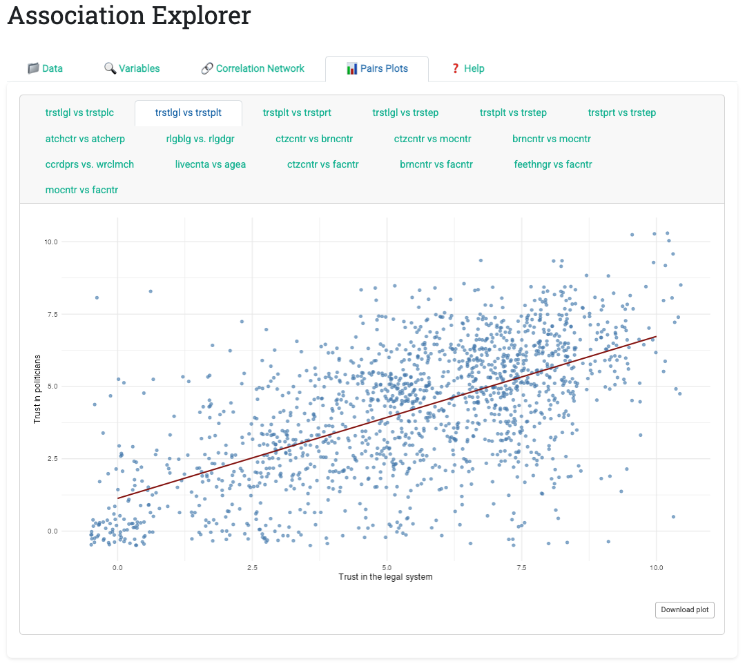
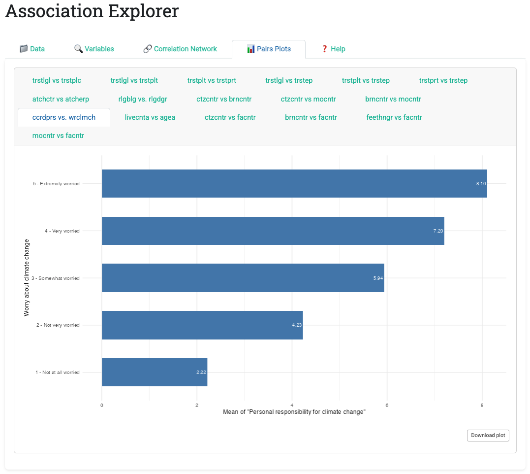
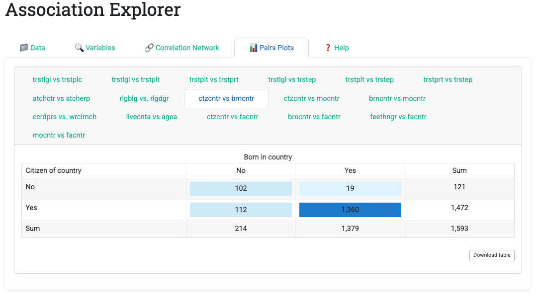
Each plot includes a download button enabling one-click export as PNG. This removes the usual export friction: no copy-paste, no screenshot tools, just one click and the image is ready for presentations or reports.
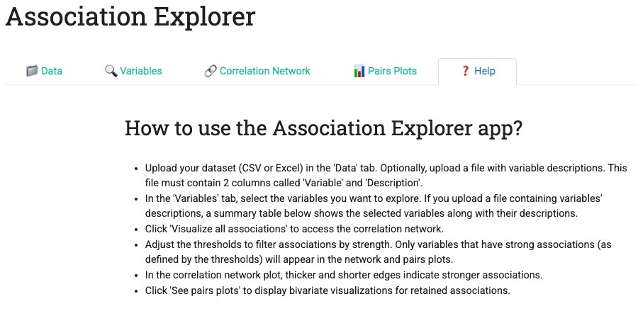
8.3.1.5 Tab 5: Help
The Help tab provides a concise, numbered workflow guide. Unlike static documentation, it lives in the app itself, always available and always relevant.
8.3.2 The Computation Engine
Behind the UI lies the correlation computation engine, which automatically:
- Detects variable types for each pairwise combination
- Applies the appropriate association measure:
- Pearson’s \(r\) for numeric-numeric pairs
- Eta for numeric-categorical pairs
- Cramér’s V for categorical-categorical pairs
- Applies thresholds (dropping weak associations)
- Constructs an association matrix used by all downstream outputs
This engine is reactive: when users adjust a threshold slider, the matrix recomputes quickly (thanks to strategic caching with reactive() expressions). All downstream outputs (network visualization, pairs plots, summary tables) update together.
8.3.3 Reactivity in Practice
AssociationExplorer demonstrates several reactive programming patterns worth studying:
Pattern 1: Cached Computation
cor_matrix_reactive <- reactive({
  req(data())
  selected_vars <- valid_selected_vars()
  selected_data <- data()[, selected_vars, drop = FALSE]
  calculate_correlations(selected_data,
                        input$threshold_num,
                        input$threshold_cat)
})
This reactive expression:
- Waits until
data()is available (req()blocks evaluation if NULL) - Recomputes only when selected variables or thresholds change
- Returns both the correlation matrix and the type of each correlation (Pearson, Eta, Cramér)
All downstream outputs (network, pairs plots, statistics) depend on this single expression, ensuring consistency.
Pattern 2: Filtered Subsets
filtered_data_for_pairs <- reactive({
  mat <- cor_matrix_vals()$cor_matrix
  nodes_to_keep <- rowSums(abs(mat) > 0) > 1  # Keep variables with >1 edge
  filtered_matrix <- mat[nodes_to_keep, nodes_to_keep]
  data()[, colnames(filtered_matrix), drop = FALSE]
})
This expression identifies which variables appear in the final network (i.e., have at least one association above the threshold), then filters the raw data to include only those variables. Subsequent bivariate plots are computed only for this reduced dataset, improving performance.
Pattern 3: Conditional Rendering
output$pairs_plot <- renderUI({
  req(input$main_tabs == "pairs_tab")  # Only compute if tab is active
  pairs <- significant_pairs()
  if (is.null(pairs) || nrow(pairs) == 0) {
    return(tags$p("No associations exceed the threshold..."))
  }
  # ... generate plots for all pairs
})
Plots are generated only when the Pairs Plots tab is active (req(input$main_tabs == "pairs_tab")), avoiding wasted computation if users never view that tab.
8.4 Part II: Handling Real Data Complexity
8.4.1 Mixed Variable Types
A defining feature of AssociationExplorer is its automatic handling of mixed variable types. Traditional statistical software forces users to specify analysis type: “correlation for numeric variables” or “chi-square for categorical variables” (Pearson 1992). AssociationExplorer unifies these under a single framework.
The underlying principle is that for each pair of variables, the appropriate association measure is chosen based on their types.
| Variable 1 Type | Variable 2 Type | Association Measure | Interpretation |
|---|---|---|---|
| Numeric | Numeric | Pearson’s r | Linear correlation; range [-1, 1] |
| Numeric | Categorical | Eta | Association strength; range [0, 1] |
| Categorical | Categorical | Cramér’s V | Association strength; range [0, 1] |
Implementation challenge: Ensuring comparability across measures. The app thresholds using \(R^2\) (coefficient of determination) for numeric measures:
- Pearson: threshold uses \(r^2\) (squared correlation)
- Eta: threshold uses \(\eta^2\) (squared effect size)
For Cramér’s V, the threshold applies directly (since \(V\) already ranges [0, 1]).
This design choice has implications:
- A threshold of 0.5 on \(R^2\) can be read as “variables explain ≥50% of each other’s variance”
- The same threshold on Cramér’s V can be read as “variables have a specific association strength of at least 0.71” (since \(0.71^2 ≈ 0.5\))
The Help tab clarifies these distinctions; users need not understand the mathematics, but they benefit from consistent, interpretable results.
8.4.2 Missing Data Handling
Real datasets contain missing values. AssociationExplorer handles them pragmatically:
- Pairwise deletion: For each variable pair, compute the association using only observations with no missing values in either variable
- Separate thresholds: Apply thresholds independently to each measure type
- Transparent reporting: Display the number of valid cases used in each bivariate plot
Example: If a dataset has 1000 rows, and a particular numeric pair has 950 complete cases, the correlation is computed on those 950. The scatter plot displays these 950 points, with jitter applied to reveal overlapping observations.
This approach balances statistical rigor (use all available data) with practical clarity (show users exactly what is being plotted).
8.4.3 Performance Optimization
AssociationExplorer processes datasets up to 10,000+ rows interactively. Performance is managed through:
- Precomputation: Upon data load, the app computes all pairwise associations once and caches them
- Lazy rendering: Bivariate plots are generated only when their tab is viewed
- Subset filtering: The pairs plot engine generates only plots for variable pairs above the threshold
- Efficient network visualization: The
visNetworkpackage uses GPU acceleration for layout algorithms
8.5 Part III: User Experience Patterns
8.5.1 Progressive Disclosure in Action
The tab structure exemplifies the progressive disclosure principle from Chapter 7. Rather than overwhelming users with all options simultaneously, AssociationExplorer reveals functionality in stages:
Implementation: Tab-based navigation (Data → Variables → Network → Pairs → Help) guides users through a linear workflow with optional shortcuts for advanced users. Each tab presents one analytic decision without exposing irrelevant options.
First-time users follow tabs sequentially. Each step introduces one analytic stage, building understanding gradually.
Experienced users jump strategically: Load data, skip to Network tab, adjust thresholds, then examine pairs plots of interest.
Iterative explorers cycle between Network and Pairs Plots, discovering patterns through threshold adjustment and focused bivariate inspection.
Benefit: Novices are never confronted with all options; the UI supports all three workflows without requiring configuration.
8.5.2 Visual Feedback and Instant Response
AssociationExplorer implements instant feedback (Chapter 7 design principle) to help users understand how their actions affect results:
Implementation: Reactive expressions ensure threshold adjustments update the network and pairs plots. Visual cues appear at every interaction:
- Threshold adjustment: Network updates in real-time, with edges appearing/disappearing as users drag sliders
- Hover interactions: Hovering over network nodes reveals full descriptions; hovering over table cells highlights the cell
- Loading indicators: Spinning loaders appear during computation, preventing confusion about whether the app is responsive
- Empty-state messaging: If no associations exceed the threshold, a clear message explains why and suggests adjusting thresholds
Benefit: This feedback loop is essential for non-technical users to build mental models of how thresholds affect results. Users see consequences of their actions immediately, enabling rapid exploration and hypothesis testing.
8.5.3 Comparison-Oriented Layouts
AssociationExplorer implements comparison-oriented layouts (Chapter 7 design principle) recognizing that patterns emerge through juxtaposition:
Implementation: Multiple linked views (network + pairs plots) enable side-by-side comparison. The pairs plots tab uses a tabbed interface allowing users to scroll through bivariate patterns across multiple associations without leaving the tab.
Users can ask questions like:
- “Do all numeric pairs show linear relationships, or are some nonlinear?”
- “How is the relationship between age and satisfaction?”
- “Which categorical pairs have more balanced contingency tables?”
Benefit: The tabbed interface enables rapid comparison; the color-coded contingency tables make patterns jump out. Users discover patterns by comparing perspectives. The network reveals which variables associate; the pairs plots reveal how.
8.7 Part V: Limitations and Future Work
8.7.1 Current Limitations
Scalability: Real-time computation becomes slow for datasets with 100+ variables. Future versions may implement sampling or pre-computed dissimilarity matrices.
Advanced Measures: The app supports only Pearson’s r, Eta, and Cramér’s V. Extensions could include polychoric correlations (for ordered categorical data) or mutual information (for nonlinear associations).
Temporal Data: No built-in support for time series. Extending the app to handle longitudinal data would require additional reactive architecture.
Reproducibility: Interactive explorations are hard to document and reproduce. Future versions may offer the possibility to export a summary report (PDF or HTML) capturing the final configuration and findings.
8.7.2 Strengths vs. Static Analysis
| Aspect | Interactive (AssociationExplorer) | Static (Script-Based) |
|---|---|---|
| Exploration | Iterative, parameter-driven | Question-driven, manual |
| Accessibility | Non-technical users | Requires programming knowledge |
| Reproducibility | Challenging (requires capturing parameter settings) | Natural (code is the documentation) |
| Publication | Requires export step | Direct from script output |
| Parameter Sensitivity | Easy to visualize | Requires manual recomputation |
Recommendation: Use AssociationExplorer for discovery and exploration; use static scripts for validation and publication.
8.8 Part VIII: Bridging to Publication
A critical challenge in exploratory analysis is transitioning from discovery to communication. AssociationExplorer addresses this through:
- One-click visualization export: Save high-resolution PNG images ready for presentations
- Publication-ready defaults: Network colors, edge widths, and font sizes are pre-tuned for readability
- Reproducibility metadata: The app could (in future versions) export the full configuration used in exploration, enabling others to reproduce findings
Recommended workflow:
- Exploration phase: Use AssociationExplorer to discover patterns
- Validation phase: Confirm findings with formal statistical tests (hypothesis tests, confidence intervals)
- Communication phase: Create static figures and tables for reports or presentations
8.9 Summary and Key Takeaways
- Automatic type detection enables analysis of heterogeneous datasets without manual preprocessing
- Progressive disclosure through tabs guides novices while empowering experienced users
- Reactive computation ensures that exploration feels instantaneous; users adjust parameters and see results immediately
- Mixed association measures unify numeric and categorical analysis under one framework
- Multiple linked views facilitate pattern discovery through comparison
- User-centered design prioritizes accessibility for non-technical practitioners over advanced statistical features
- Iterative exploration uncovers patterns that single-hypothesis testing often misses
- Interactive and static workflows are complementary: Use interactivity for discovery, static output for communication
8.10 Looking Ahead
With both Shiny principles (Chapter 7) and their practical implementation in AssociationExplorer (this chapter) established, we now turn to the next frontier: interpreting and communicating association patterns effectively.
The chapters that follow move beyond pair-wise associations to higher-level patterns:
- Community detection in networks: Which groups of variables cluster together?
- Causal reasoning: How do we move from observed associations to causal claims?
- Visualization best practices: How do we communicate complex patterns to non-technical audiences?
AssociationExplorer provides the interactive tool for exploration; subsequent chapters provide the conceptual frameworks for interpretation and communication.