The previous chapters focused on discovery: we computed association measures, visualized networks, and built interactive tools for exploration. But discovery is only part of the journey. Findings are most useful when they can be communicated clearly.
Validation phase: Confirm patterns with formal tests, assess robustness to data perturbations
Communication phase (this chapter): Translate findings into visualizations and narratives for non-technical audiences
Many analyses struggle at step 3. A researcher may discover a striking pattern in an interactive tool, then find it difficult to convey in a static presentation. The network can look clear on screen but become hard to read in a printed report. The statistical \(p\)-value may be decisive for the analyst but less meaningful to a journalist or policymaker.
This chapter addresses the communication gap. We focus on principles and practices for translating association patterns into visualizations that inform rather than confuse, and that persuade through clarity rather than complexity.
9.2 Part I: Visualization Principles for Association Patterns
9.2.1 Encode the Right Information
Not all information deserves visual encoding. In association analysis, the key insights are typically:
Which variables associate? (Identity)
How strong is the association? (Magnitude)
What is the direction? (Sign: positive or negative)
Are there outliers or exceptions? (Variance)
Secondary information (exact correlation coefficients, sample sizes, confidence intervals) can appear in tables or captions without cluttering the visualization.
Principle: Encode primary insights visually; reserve tables for secondary details.
9.2.1.1 Visual Variables and Their Strengths
Different visual channels carry different cognitive weight:
Visual Channel
Strength
Best For
Pitfalls
Position
Strongest
Numeric magnitudes (scatterplot axes)
Requires careful scale choice
Length/Size
Very strong
Comparing quantities (bar height, node size)
Easy to misinterpret without baseline
Color (hue)
Moderate
Categorical distinctions
Not perceptually uniform; avoid rainbow palettes
Color (saturation/value)
Strong
Ordered categories or numeric ranges
Requires careful selection for accessibility
Texture/Pattern
Weak
Last resort for categorical data
Hard to distinguish; rarely necessary
Implication for association networks:
Use position (network layout) to reveal clustering
Use edge thickness/length (size channel) to encode strength
Use edge color (hue) for direction or variable type
Use node size only if a node attribute (e.g., degree) deserves emphasis
9.2.2 Design for Your Audience
Visualizations are most effective when tailored to audience expertise and context:
Academic audience (researchers, statisticians):
Precision and rigor are valued
Legends with exact scale ranges are expected
Multiple views may be appropriate (show robustness)
Methodological details belong in captions
Professional audience (managers, policymakers):
Action and insight are valued
Simple narratives beat nuanced caveats
One clean visualization often beats three complex ones
Consider trading precision for clarity when needed
Public audience (journalists, general readers):
Story and emotion matter as much as data
Metaphors and analogies help
Avoid jargon where possible
One key message per visualization
A single dataset may benefit from different visualizations for these audiences.
9.2.3 Reduce Cognitive Load
Our visual working memory is limited. Too many elements, colors, or overlapping lines can create cognitive overload, causing viewers to disengage rather than engage.
Strategies to reduce load:
Declutter: Remove gridlines, axis spines, and decorative elements
Group and order: Sort categories by value, arrange elements meaningfully (not alphabetically)
Highlight selectively: Use color sparingly; make important elements pop by muting others
Segment: Split complex patterns into small multiples (faceted plots) rather than one dense visualization
Annotate directly: Label key points on the plot rather than forcing readers to match legend to data
9.2.4 Use Color Deliberately
Color is powerful but easily misused. Poor color choices can mislead, exclude readers with colorblindness, or fail in grayscale printing.
For categorical data: Use distinct, qualitatively different colors. Tools like ColorBrewer (colorbrewer2.org) provide tested palettes. Avoid rainbow palettes; they are perceptually non-uniform and difficult to distinguish.
For numeric data: Use a sequential palette (light to dark) for increasing values, or a diverging palette (dark-light-dark) for data with a meaningful midpoint (e.g., negative to positive correlation).
For accessibility: Include a colorblind-friendly option when possible. Test visualizations with tools like Coblis or Color Oracle. When in doubt, supplementary patterns or text labels can ensure clarity without relying on color alone.
9.3 Part II: Visualizing Bivariate Associations
9.3.1 Numeric × Numeric: Scatterplots and Alternatives
The scatterplot is the default, but several variants serve different purposes:
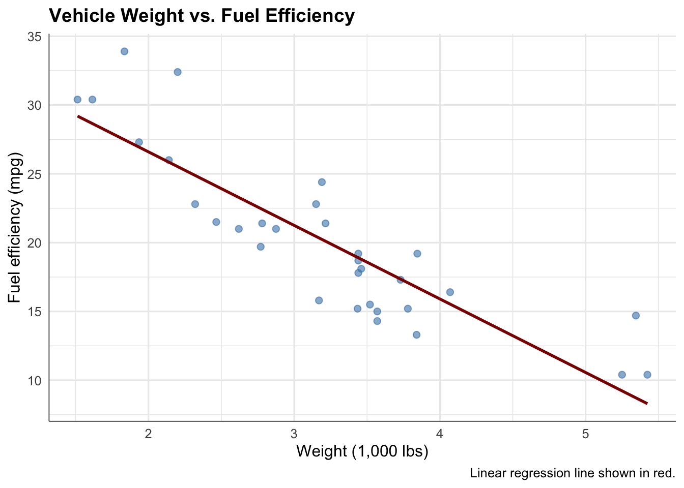
9.3.1.1 Basic Scatterplot with Trend
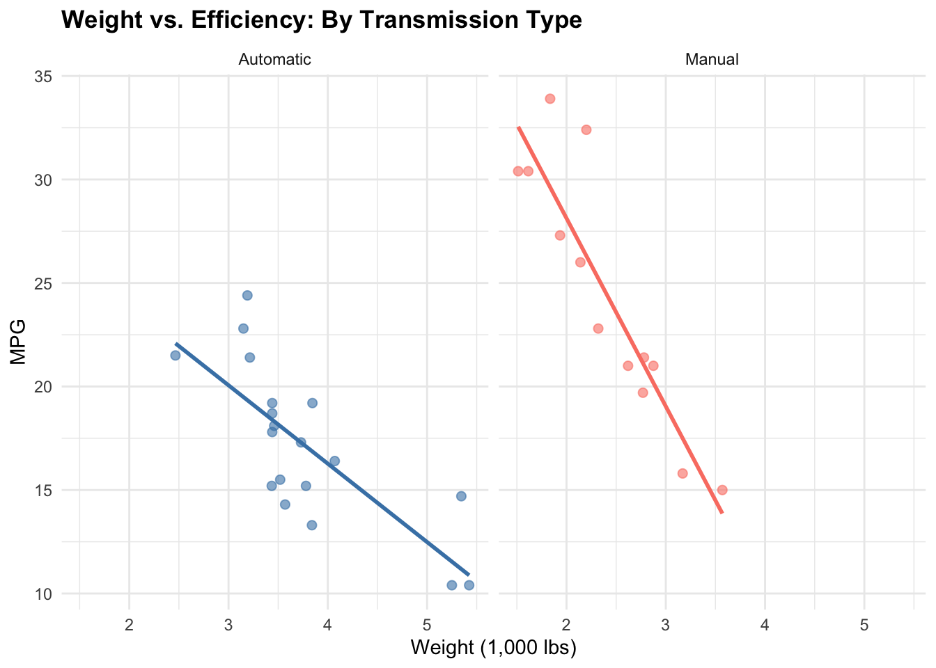
# Clean, minimal scatterplotmtcars |>ggplot(aes(x = wt, y = mpg)) +geom_point(alpha =0.6, size =2, color ="steelblue") +geom_smooth(method ="lm", se =FALSE, color ="darkred", linewidth =1) +labs(title ="Vehicle Weight vs. Fuel Efficiency",x ="Weight (1,000 lbs)",y ="Fuel efficiency (mpg)",caption ="Linear regression line shown in red." ) +theme_minimal(base_size =12) +theme(plot.title =element_text(face ="bold", size =14),axis.line =element_line(color ="gray20", linewidth =0.3) )
Strengths: Shows individual data points, reveals outliers, allows visual assessment of linearity and scatter
Weaknesses: Overplotting if many points overlap; hard to see underlying density
When to use: Small to moderate datasets (< 1,000 points), when individual points matter or outliers are interesting
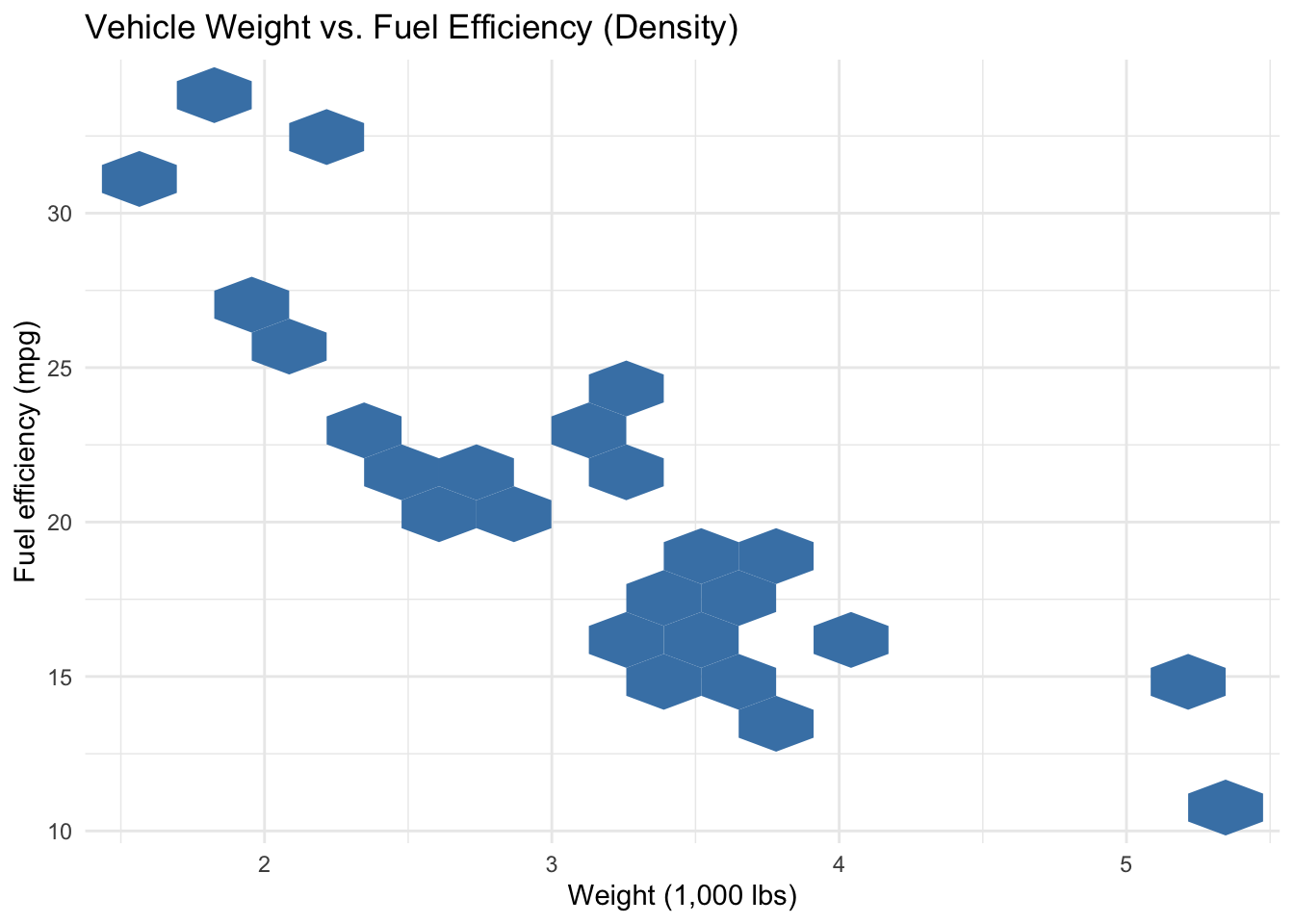
9.3.1.2 Hexbin or 2D Density for Overplotting
# Heatmap version for many overlapping pointsmtcars |>ggplot(aes(x = wt, y = mpg)) +geom_hex(bins =15, fill ="steelblue") +scale_fill_gradient(low ="white", high ="darkblue", name ="Count") +labs(title ="Vehicle Weight vs. Fuel Efficiency (Density)",x ="Weight (1,000 lbs)",y ="Fuel efficiency (mpg)" ) +theme_minimal()
Strengths: Reveals density where points overlap; works for large datasets
Weaknesses: Obscures individual data; harder to spot outliers
When to use: Large datasets (> 5,000 points), when patterns at scale matter more than individuals
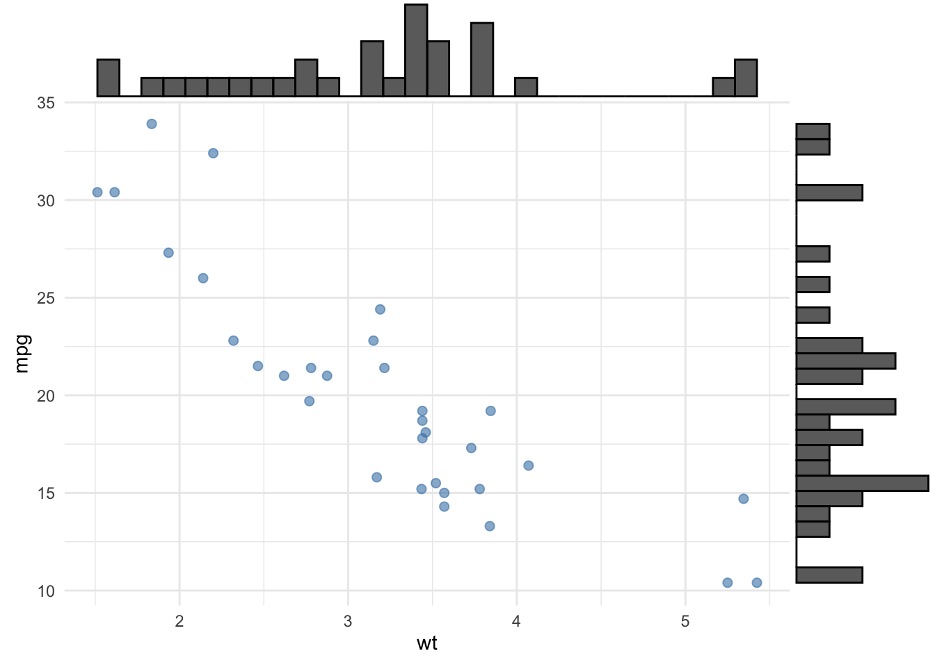
9.3.1.3 Marginal Distributions
# Scatterplot with marginal histograms (using ggExtra or similar)base_plot <- mtcars |>ggplot(aes(x = wt, y = mpg)) +geom_point(alpha =0.6, size =2, color ="steelblue") +theme_minimal()# Combine with marginal histograms (pseudo-code)ggExtra::ggMarginal(base_plot, type ="histogram", margins ="both")
Strengths: Shows bivariate and univariate patterns simultaneously; reveals skewness or modality in each variable
Weaknesses: More complex; requires additional packages
When to use: Academic or detailed exploratory contexts where understanding each variable’s shape matters
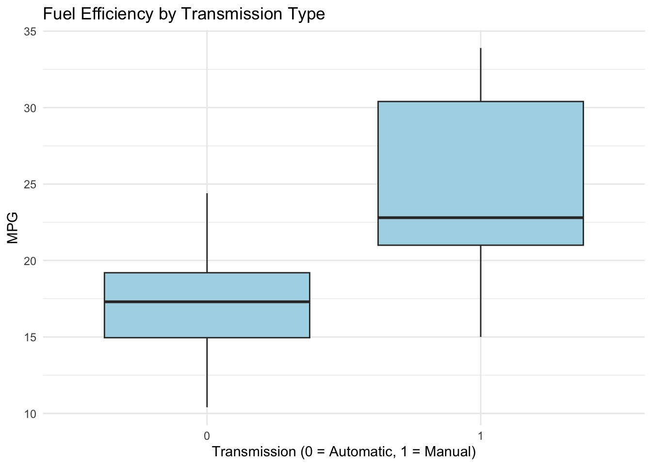
# Boxplot: median, quartiles, outliersmtcars |>ggplot(aes(x =factor(am), y = mpg)) +geom_boxplot(fill ="lightblue", color ="gray20") +labs(title ="Fuel Efficiency by Transmission Type",x ="Transmission (0 = Automatic, 1 = Manual)",y ="MPG" ) +theme_minimal()
Strengths: Compact, shows quartiles and outliers, familiar to technical audiences
Weaknesses: Hides multimodality; loses individual data points
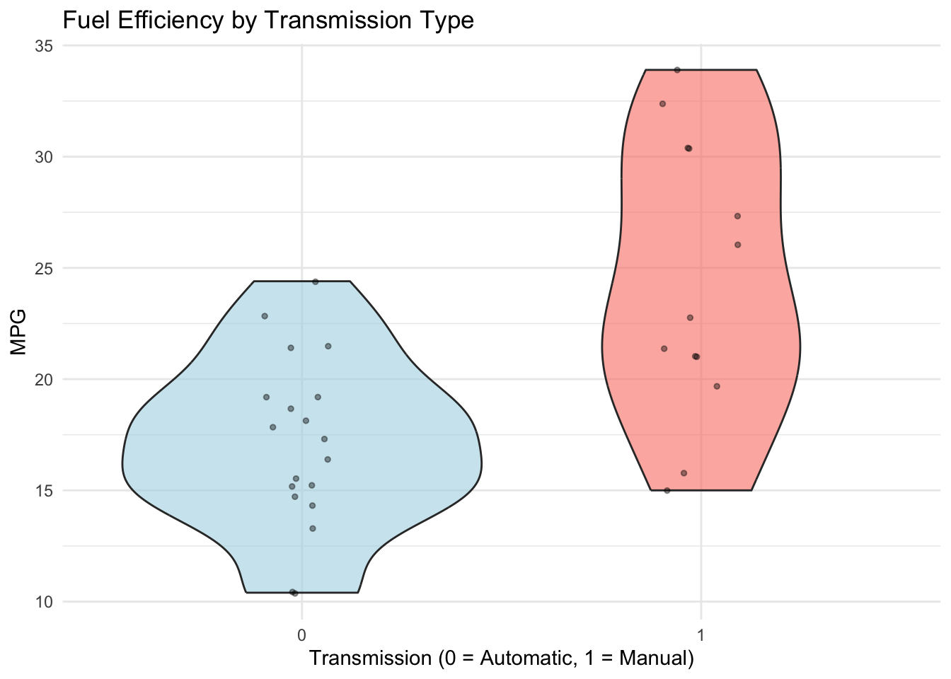
9.3.2.2 Violin Plots
# Violin plot: full density by categorymtcars |>ggplot(aes(x =factor(am), y = mpg, fill =factor(am))) +geom_violin(alpha =0.6) +geom_jitter(width =0.1, alpha =0.4, size =1) +scale_fill_manual(values =c("lightblue", "salmon"), guide ="none") +labs(title ="Fuel Efficiency by Transmission Type",x ="Transmission (0 = Automatic, 1 = Manual)",y ="MPG" ) +theme_minimal()
Strengths: Shows full distribution, reveals bimodality, includes jittered points
Weaknesses: Larger visual footprint; less familiar to non-technical audiences
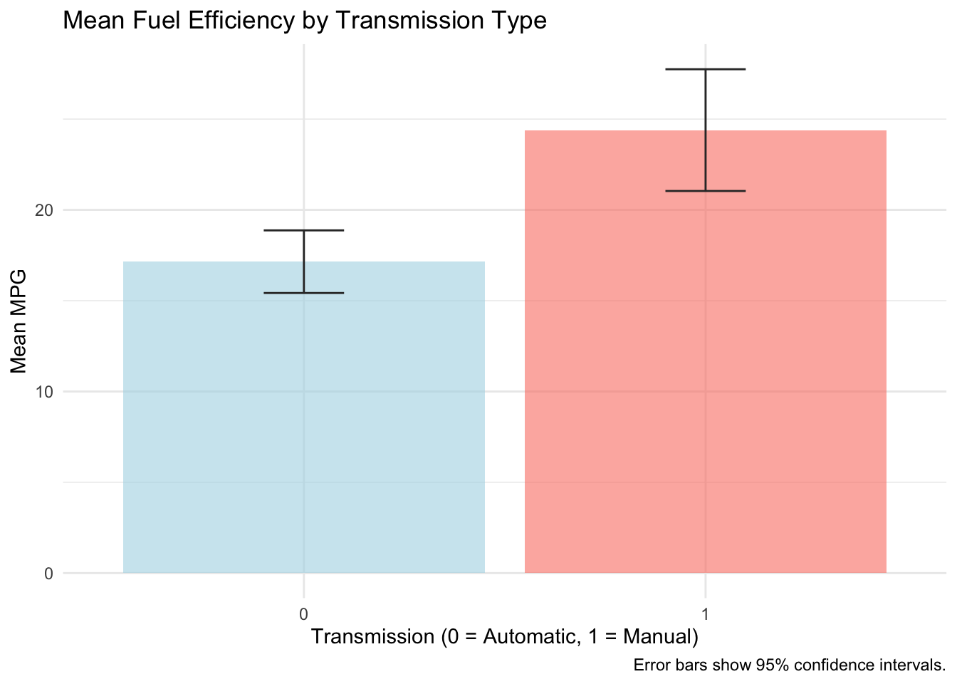
9.3.2.3 Mean Plots with Error Bars
# Mean with error bars (SE or CI)mtcars |>group_by(am) |>summarise(mean_mpg =mean(mpg),se =sd(mpg) /sqrt(n()),.groups ="drop" ) |>ggplot(aes(x =factor(am), y = mean_mpg, fill =factor(am))) +geom_col(alpha =0.6) +geom_errorbar(aes(ymin = mean_mpg -1.96* se, ymax = mean_mpg +1.96* se),width =0.2, color ="gray20") +scale_fill_manual(values =c("lightblue", "salmon"), guide ="none") +labs(title ="Mean Fuel Efficiency by Transmission Type",x ="Transmission (0 = Automatic, 1 = Manual)",y ="Mean MPG",caption ="Error bars show 95% confidence intervals." ) +theme_minimal()
Strengths: Clear, actionable, easy to compare magnitudes, includes uncertainty quantification
Weaknesses: Oversimplifies distribution; hides individual variation and outliers
When to use: When comparing group averages is the primary goal; good for presentations
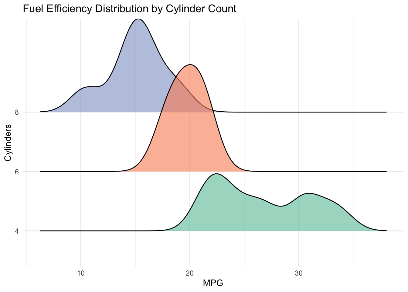
9.3.2.4 Ridgeline Plots
# Ridgeline: density for each categorymtcars |>ggplot(aes(x = mpg, y =factor(cyl), fill =factor(cyl))) +geom_density_ridges(alpha =0.6) +scale_fill_brewer(palette ="Set2", guide ="none") +labs(title ="Fuel Efficiency Distribution by Cylinder Count",x ="MPG",y ="Cylinders" ) +theme_minimal()
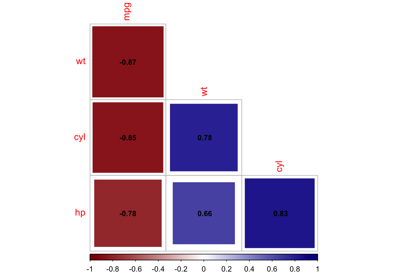
Academic framing: “Among 32 vehicles, a strong negative correlation (\(r = -0.87\), 95% CI \([-0.93, -0.74]\)) exists between weight and fuel efficiency, suggesting that vehicle mass is a significant determinant of energy consumption.”
Professional framing: “Lighter vehicles consistently achieve better fuel economy. For every 1,000-pound increase in weight, we observe approximately 5.4 fewer miles per gallon.”
Public framing: “Heavy SUVs and trucks guzzle gas. Compact cars and hybrids go further on less fuel. It’s physics.”
Each version is truthful but optimized for its audience.
9.6 Part V: Common Pitfalls and How to Avoid Them
9.6.1 Overplotting and Obscuration
Problem: Too many overlapping points; underlying pattern invisible
Solution: Use transparency (alpha), jitter slightly, or switch to density plot or hexbin
9.6.2 Dual-Axis Plots
Problem: Two different scales on same plot can manipulate perception (axis scaling changes appear misleading)
Solution: Facet instead; if both axes are necessary, use same scale or clearly label both
9.6.3 3D Visualizations
Problem: 3D plots distort distances and make comparison harder, not easier
Solution: Use faceted 2D plots or interactive 3D plots (but not static 3D printed plots)
9.6.4 Truncated Axes
Problem: Starting y-axis at non-zero value exaggerates differences
Solution: Always start at zero for bar charts; for scatterplots, include enough padding to show context
9.6.5 Chart Junk and Decoration
Problem: Decorative elements (3D effects, gradient fills, gridlines, background images) distract from data
Solution: Minimize. Use white or light gray backgrounds, remove unnecessary gridlines, use simple shapes
9.6.6 Inconsistent Scales Across Panels
Problem: Different scales in faceted plots make comparison impossible
Solution: Always use scales = "fixed" in faceted plots unless scale variation is the story
9.7 Part VI: Accessibility and Inclusive Design
Thoughtful visualization serves diverse audiences and abilities.
9.7.1 Colorblind-Friendly Design
Approximately 8% of men and 0.5% of women have color blindness. Designs are best when they avoid relying solely on color distinctions:
Use colorblind-friendly palettes (Viridis, ColorBrewer’s “colorblind-safe” option)
Supplement color with pattern or text (e.g., labels on nodes)
Test visualizations with colorblind simulation tools
9.7.2 Visual Clarity for Low-Vision Readers
Large fonts (minimum 12pt for body text, 14pt+ for titles)
High contrast (dark text on light background or vice versa)
Non-default line widths (thicker lines for visibility)
Avoid light gray text
9.7.3 Interpretability for Non-Technical Readers
Avoid jargon; define technical terms in caption
Include units (not just “mpg” but “miles per gallon”)
Provide a “take-home” sentence above or below the plot
9.8 Summary and Key Takeaways
Design for discovery: Visualizations can aim to reveal patterns, not obscure them through decoration or complexity
Match form to audience: Academic precision, professional clarity, public simplicity—three audiences, three visualizations
Encode wisely: Use visual channels (position, size, color) strategically; encode most important information first
Pair visualization with narrative: A chart without explanation leaves viewers confused; text without visualization misses emotional impact
Test accessibility: Color, contrast, and clarity matter for inclusivity
Export thoughtfully: Move from interactive exploration to static communication; recreate visualizations with intentional design
Context is king: The same data can support multiple true stories, depending on framing and audience
9.9 Looking Ahead
With the foundations of association analysis (Chapters 3–6), interactive tools (Chapters 7–8), and communication strategies (this chapter) established, we now move beyond pairwise relationships to higher-order patterns and predictive modeling.
The chapters that follow introduce methods for:
Regression trees (Chapter 10): Non-parametric discovery of feature interactions and segmentation
Classification trees (Chapter 11): Predicting discrete outcomes while maintaining interpretability
Ensemble methods (Chapter 12): Combining multiple models for improved predictions
These methods shift perspective: instead of asking “What associations exist?”, we ask “Can we predict or segment based on these associations?” But interpretability remains paramount. We aim to avoid black-box models, instead focusing on methods that stay true to the descriptive, exploratory spirit of this book.
Hartigan, J. A., and B. Kleiner. 1981. “Mosaics for Contingency Tables.” In Computer Science and Statistics: Proceedings of the 13th Symposium on the Interface, 268–73. Springer US. https://doi.org/10.1007/978-1-4613-9464-8_37.