15Partial Dependence and Individual Conditional Expectation
15.1 Introduction: Moving from Importance to Functional Interpretation
In the previous chapter, we focused on feature importance as a global ranking device. That perspective helps us identify which predictors the model appears to rely on most. It does not yet tell us how predictions change as a predictor varies.
Partial dependence and individual conditional expectation (ICE) plots address this next layer of interpretation. Rather than asking only which variables matter, we ask how model predictions respond across the range of one or more predictors. This shift is central in descriptive work with nonlinear models, because it reveals shape, heterogeneity, and potential interaction structure.
This chapter develops both methods from first principles, then implements them in reproducible R code on a tree based model. We emphasize practical interpretation, known limitations, and communication choices that keep conclusions technically accurate.
15.2 Why Profile Based Explanations Matter
Feature rankings are compact and useful, but they collapse functional detail. Two predictors may receive similar importance scores while having very different predictive patterns, for example, one roughly monotonic and another strongly nonlinear.
Profile based summaries help with questions such as:
how predictions evolve over the observed range of a predictor,
whether effects appear approximately linear, threshold-like, or saturating,
whether different observations exhibit similar or divergent response profiles.
These are descriptive statements about fitted model behavior under the empirical data distribution. As discussed earlier in the book, they should not be interpreted as causal response functions.
15.3 Formal Definitions
Let a fitted predictor be denoted by \(\hat{f}(x)\), and partition the feature vector as \((x_s, x_C)\), where \(x_s\) is the focal feature (or feature subset) and \(x_C\) collects the remaining features.
15.3.1 Partial Dependence Function
Building on the introductory formulation presented earlier in the book, we now write partial dependence for a subset of focal features \(S\) (with complement \(C\)):
This notation accommodates one dimensional and multi dimensional profiles in a unified way. Operationally, we evaluate the estimator on a grid of \(x_S\) values and average predictions at each grid point.
PD is the average of ICE curves over observations. This relationship is important, because it shows what PD can hide. If ICE curves differ substantially in shape, the average can mask heterogeneity.
15.3.3 Centered ICE Curves
A common variant is centered ICE (c-ICE), where each ICE curve is shifted to a common reference value \(x_s^{ref}\)(Goldstein et al. 2015):
The predictive error gives context for interpretation. Profile based explanations are most informative when the model captures a meaningful share of signal.
15.5 Computing One Dimensional Partial Dependence
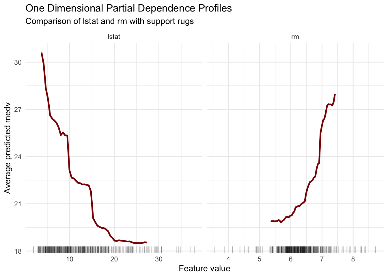
As introduced earlier in the book (see Chapter 13), one dimensional PD is obtained by averaging predictions while varying one focal feature over a grid. Here we move one step further by comparing PD profiles for two predictors, lstat and rm, to emphasize that profile interpretation is inherently comparative.
pd_profiles |>ggplot(aes(x = value, y = pd)) +geom_line(color ="darkred", linewidth =1) +geom_rug(data = rug_profiles,aes(x = value, y =NULL),inherit.aes =FALSE,sides ="b",alpha =0.20 ) +facet_wrap(~ variable, scales ="free_x") +labs(title ="One Dimensional Partial Dependence Profiles",subtitle ="Comparison of lstat and rm with support rugs",x ="Feature value",y ="Average predicted medv" ) +theme_minimal()
The two panels highlight complementary directions of association. As lstat increases, the average prediction decreases, while larger rm values are associated with higher predicted medv. In both cases, the curvature suggests that effects are not well summarized by a single linear slope.
15.6 Individual Conditional Expectation and Heterogeneity
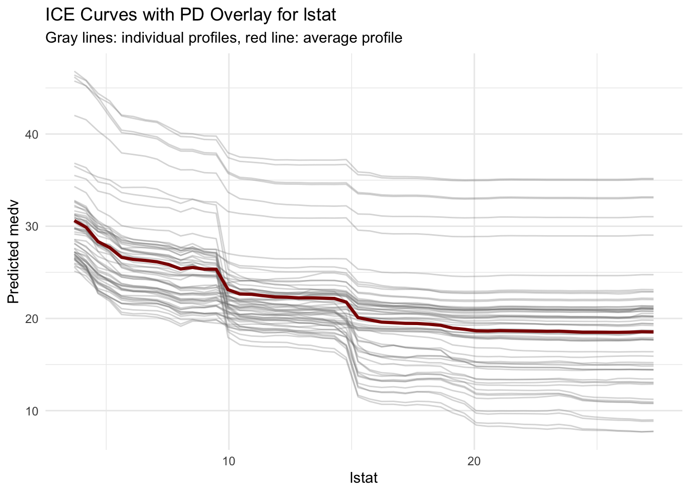
To inspect whether this average pattern is broadly shared, we compute ICE curves for a subsample of observations.
ice_lstat |>ggplot(aes(x = value, y = ice, group = obs_id)) +geom_line(color ="gray50", alpha =0.30) +geom_line(data = pd_lstat,aes(x = value, y = pd),inherit.aes =FALSE,color ="darkred",linewidth =1.1 ) +labs(title ="ICE Curves with PD Overlay for lstat",subtitle ="Gray lines: individual profiles, red line: average profile",x ="lstat",y ="Predicted medv" ) +theme_minimal()
The spread of gray lines shows that observations do not all respond identically. PD remains useful as a summary, but ICE reveals that a single average curve can hide meaningful variation.
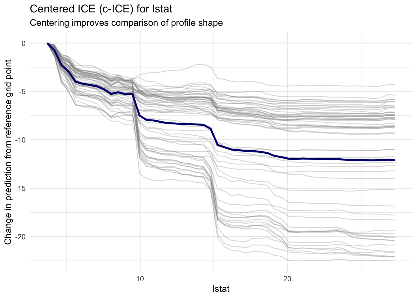
15.7 Centered ICE for Shape Comparison
Vertical differences between ICE curves often reflect baseline prediction level rather than slope behavior. Centering helps isolate shape differences.
ice_centered |>ggplot(aes(x = value, y = ice_c, group = obs_id)) +geom_line(color ="gray55", alpha =0.30) +geom_line(data = pd_centered,aes(x = value, y = pd_c),inherit.aes =FALSE,color ="navy",linewidth =1.1 ) +labs(title ="Centered ICE (c-ICE) for lstat",subtitle ="Centering improves comparison of profile shape",x ="lstat",y ="Change in prediction from reference grid point" ) +theme_minimal()
In this representation, we can compare profile slopes more directly. Divergence in c-ICE trajectories suggests interaction effects or observation specific nonlinearities.
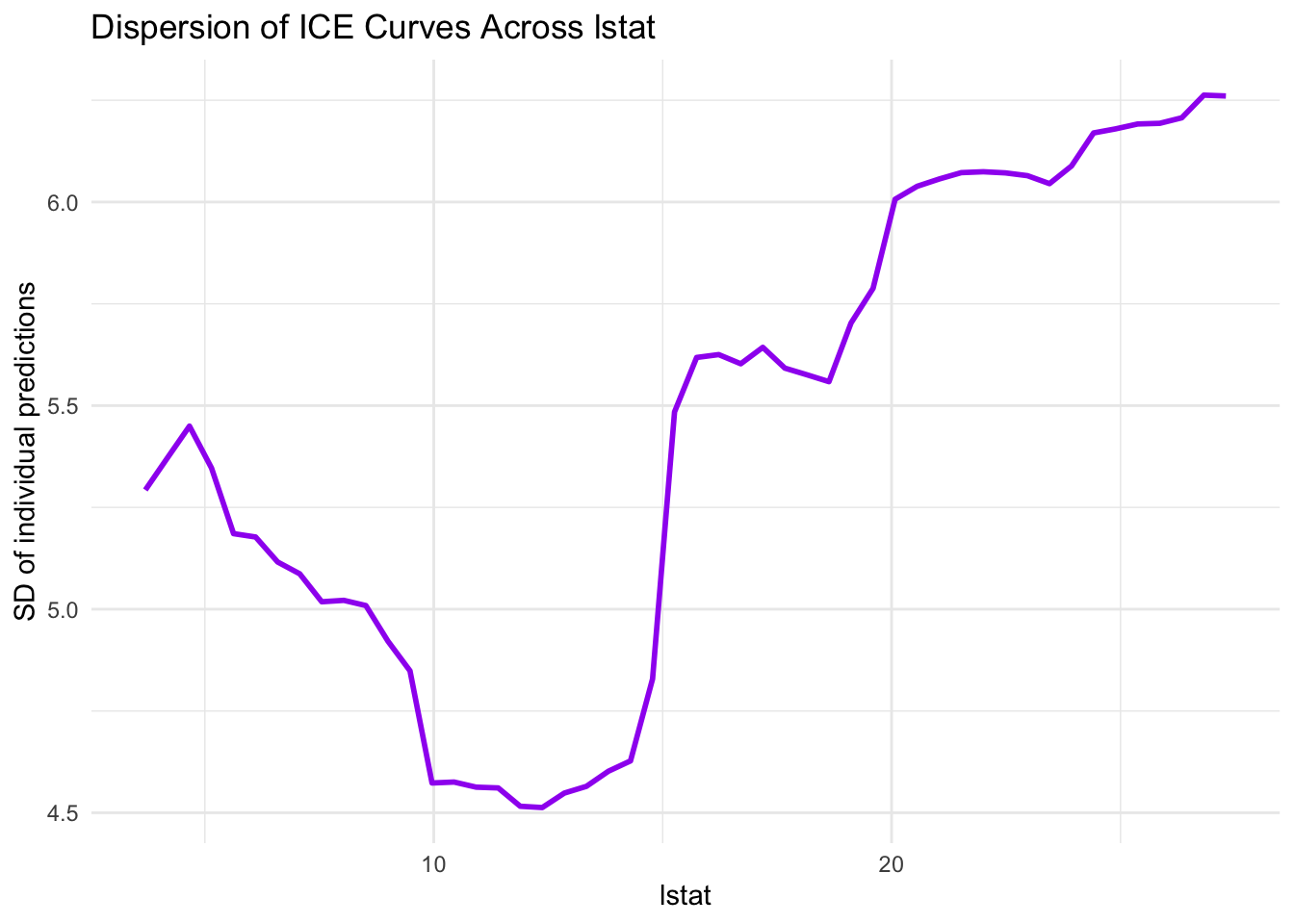
15.8 Quantifying ICE Dispersion Along the Grid
Visual inspection is important, and a small numeric summary can also help. We compute the standard deviation of ICE predictions at each grid point.
ice_dispersion |>ggplot(aes(x = value, y = sd_ice)) +geom_line(color ="purple", linewidth =1) +labs(title ="Dispersion of ICE Curves Across lstat",x ="lstat",y ="SD of individual predictions" ) +theme_minimal()
Higher dispersion regions indicate where individual profiles differ more strongly. These zones are often where interaction structure is more pronounced.
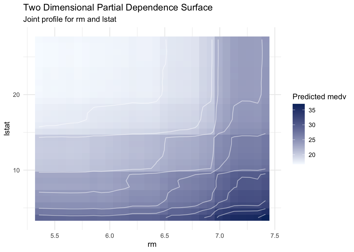
15.9 Two Dimensional Partial Dependence
When interactions are suspected between two predictors, a two dimensional PD surface can provide a useful global view.
pd_rm_lstat |>ggplot(aes(x = value1, y = value2, z = pd)) +geom_tile(aes(fill = pd)) +geom_contour(color ="white", alpha =0.5) +scale_fill_gradient(low ="#f7fbff", high ="#08306b") +labs(title ="Two Dimensional Partial Dependence Surface",subtitle ="Joint profile for rm and lstat",x ="rm",y ="lstat",fill ="Predicted medv" ) +theme_minimal()
This surface supports a joint reading. Predictions tend to increase with larger rm and decrease with larger lstat, and contour geometry helps us assess whether the combined pattern is approximately additive or more interaction-like.
15.10 Practical Limitations and Interpretation Cautions
PD and ICE are powerful, but they rely on assumptions that deserve explicit attention.
Correlation among predictors can create unrealistic combinations when we vary one feature while keeping others fixed from observed rows. This can affect profile shape.
Support awareness matters. Curves are most reliable in regions with adequate data density, which is why rugs or density overlays are useful.
Averaging can obscure heterogeneity. PD should be interpreted jointly with ICE whenever interaction effects are plausible.
Descriptive, not interventional. These curves describe model predictions under observed covariate structure, not causal effects of manipulating predictors.
In practice, we often combine profile methods with other interpretability summaries, such as permutation importance and local attributions, to obtain a more balanced account.
15.11 Summary and Key Takeaways
Partial dependence and ICE add functional detail to model interpretation. Several points from this chapter are central:
Partial dependence is a global average profile over non focal predictors.
ICE exposes observation level variation that PD can hide.
Centered ICE improves shape comparison by removing baseline offsets.
Two dimensional PD helps inspect joint structure and potential interactions between predictors.
Interpretation quality depends on data support and dependence structure, so profile reading should be paired with caution and complementary diagnostics.
Together, these tools provide a richer descriptive view of model behavior than variable ranking alone.
15.12 Looking Ahead
The next chapter turns to Shapley value based explanations. Whereas partial dependence and ICE focus on functional profiles across feature values, Shapley methods decompose individual predictions into additive feature contributions. This gives us a complementary local perspective, and helps connect global patterns to case specific explanations.
Friedman, Jerome H. 2001. “Greedy Function Approximation: A Gradient Boosting Machine.”The Annals of Statistics 29 (5). https://doi.org/10.1214/aos/1013203451.
Goldstein, Alex, Adam Kapelner, Justin Bleich, and Emil Pitkin. 2015. “Peeking Inside the Black Box: Visualizing Statistical Learning with Plots of Individual Conditional Expectation.”Journal of Computational and Graphical Statistics 24 (1): 44–65. https://doi.org/10.1080/10618600.2014.907095.