6  Network Representations of Multivariate Associations

6.1 Introduction: From Matrices to Networks

In previous chapters, we computed correlation matrices and visualized associations as rectangular arrays or heatmaps. Yet when many variables are involved, these representations can become difficult to parse. A correlation matrix with 50 variables contains 1,225 pairwise associations, which is more than most of us can comfortably scan at once.

Network representations offer an alternative visual and analytical framework. Instead of viewing all associations at once, networks can highlight meaningful connections while suppressing noise, allowing us to:

  1. Identify clusters of strongly related variables
  2. Detect hub variables that associate with many others
  3. Reveal hierarchical structures in complex data
  4. Quantify network properties that describe overall structure

A network (or graph) consists of:

  • Nodes: Representing entities (in our case, variables)
  • Edges: Representing relationships (correlations, associations, dependencies)
  • Weights (optional): Representing edge strength

This chapter walks through how to transform association matrices into networks, visualize them effectively, and compute network metrics to understand multivariate structure.

6.2 Part I: From Associations to Networks

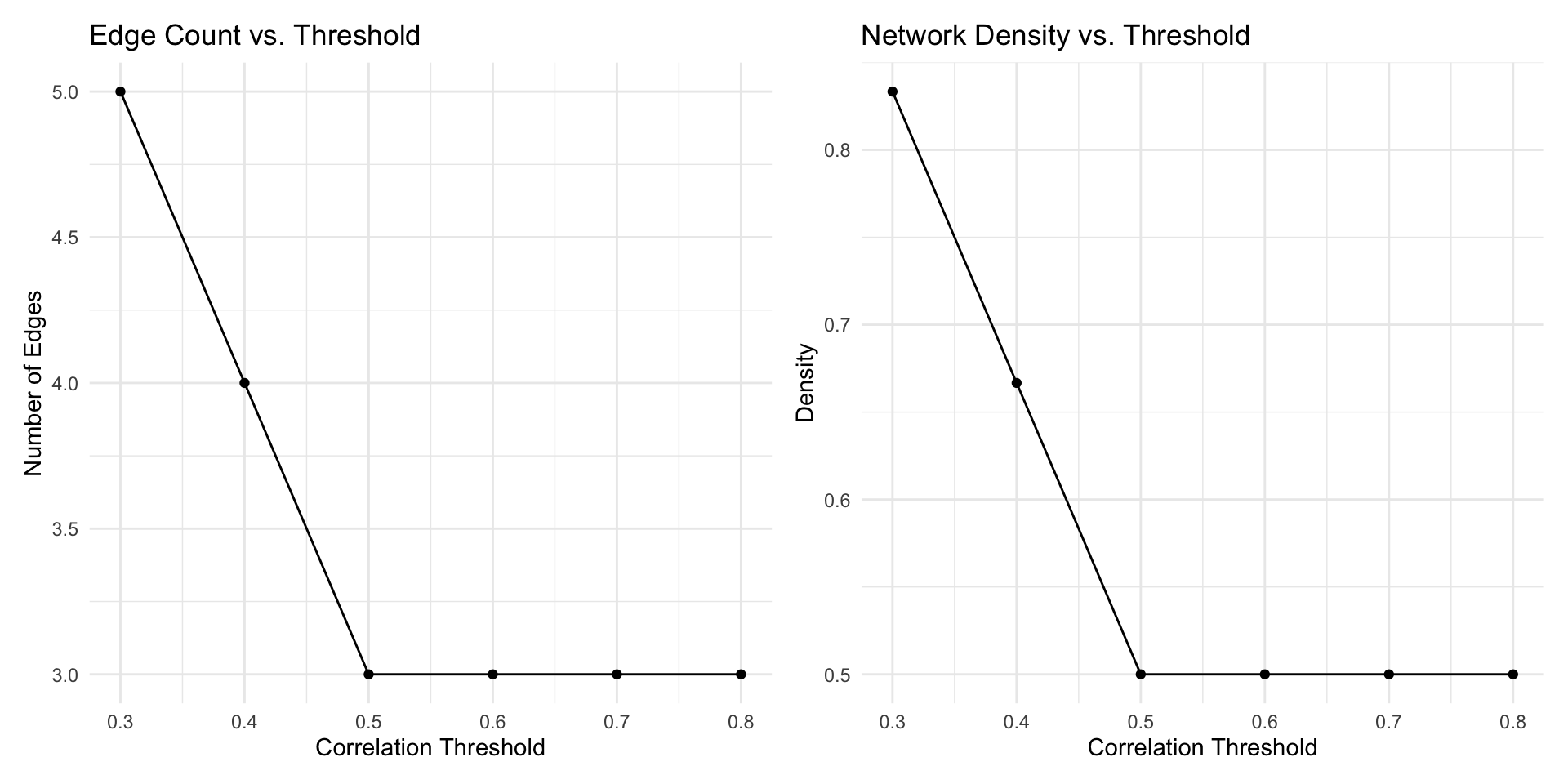
6.2.1 Thresholding: Creating Sparsity

A correlation matrix for \(p\) variables is typically dense, as nearly every cell contains a value. When we plot this as a network, it creates a hairball of connections, revealing little structure.

One common solution is thresholding: we retain only associations that exceed some cutoff in absolute value, discarding weaker associations to create sparse networks.

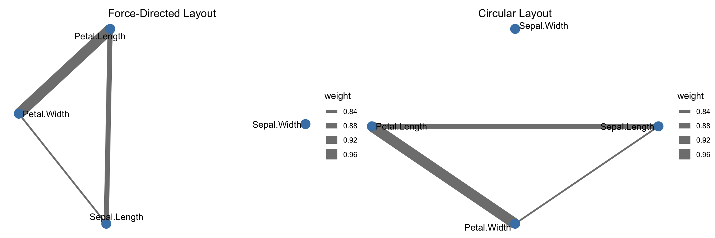
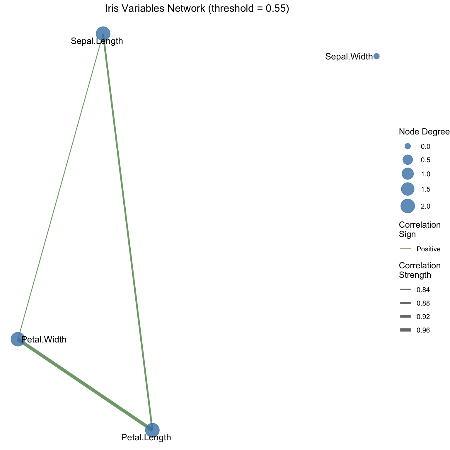
We begin with iris, a classic built-in R dataset with 150 flower observations from three species (setosa, versicolor, virginica) and four numeric measurements (sepal length/width, petal length/width), which makes it ideal for compact association networks.

# Load example data: Iris dataset
data(iris)

# Select numeric variables
iris_numeric <- iris |>
  select(-Species) |>
  as.data.frame()

# Compute correlation matrix
cor_matrix <- cor(iris_numeric)

# Display raw correlations
cor_matrix |>
  as.data.frame() |>
  tibble::rownames_to_column(var = "Variable") |>
  gt() |>
  fmt_number(columns = -Variable, decimals = 3)
Variable Sepal.Length Sepal.Width Petal.Length Petal.Width
Sepal.Length 1.000 −0.118 0.872 0.818
Sepal.Width −0.118 1.000 −0.428 −0.366
Petal.Length 0.872 −0.428 1.000 0.963
Petal.Width 0.818 −0.366 0.963 1.000

6.2.2 Creating a Network from Correlation Thresholds

# Step 1: Define threshold
threshold <- 0.5

# Step 2: Create adjacency matrix (1 if |correlation| > threshold, 0 otherwise)
adjacency_matrix <- (abs(cor_matrix) > threshold) * 1

# Remove diagonal (self-loops)
diag(adjacency_matrix) <- 0

# Step 3: Convert to igraph object with weighted values
iris_network <- graph_from_adjacency_matrix(
  adjacency_matrix,
  mode = "undirected",
  weighted = cor_matrix,
  diag = FALSE
)

# Display basic network properties
cat("Network Summary:\n")
Network Summary:
cat("Number of nodes:", vcount(iris_network), "\n")
Number of nodes: 4 
cat("Number of edges:", ecount(iris_network), "\n")
Number of edges: 3 
cat("Network density:", edge_density(iris_network), "\n")
Network density: 0.5 

6.2.3 Choosing the Right Threshold

The threshold is important: too high and we lose structure; too low and we recreate the hairball.

# Test multiple thresholds
thresholds <- seq(0.3, 0.8, by = 0.1)

threshold_analysis <- tibble(
  Threshold = thresholds,
  Edges = map_dbl(thresholds, ~{
    adj <- (abs(cor_matrix) > .x) * 1
    diag(adj) <- 0
    sum(adj) / 2  # Divide by 2 for undirected graph
  }),
  Density = map_dbl(thresholds, ~{
    adj <- (abs(cor_matrix) > .x) * 1
    diag(adj) <- 0
    n <- nrow(adj)
    sum(adj) / (n * (n - 1))
  })
)

# Visualize threshold effects
p1 <- ggplot(threshold_analysis, aes(x = Threshold, y = Edges)) +
  geom_line() +
  geom_point() +
  labs(title = "Edge Count vs. Threshold",
       x = "Correlation Threshold",
       y = "Number of Edges") +
  theme_minimal()

p2 <- ggplot(threshold_analysis, aes(x = Threshold, y = Density)) +
  geom_line() +
  geom_point() +
  labs(title = "Network Density vs. Threshold",
       x = "Correlation Threshold",
       y = "Density") +
  theme_minimal()

p1 + p2

6.3 Part II: Network Visualization

6.3.1 Graph Layouts

How nodes are positioned crucially affects interpretability. Different layout algorithms emphasize different structural properties:

  • Force-directed (Fruchterman-Reingold): Nodes repel each other, and edges act as springs. Reveals clusters.
  • Circular: Arranges nodes in a circle. Useful for showing all labels clearly.
  • Hierarchical: Arranges nodes by levels. Useful for tree-like structures.
# Create networks with different thresholds for visualization
threshold_tight <- 0.6
adj_tight <- (abs(cor_matrix) > threshold_tight) * 1
diag(adj_tight) <- 0
net_tight <- graph_from_adjacency_matrix(adj_tight, mode = "undirected", diag = FALSE)

# Assign correlation values as edge attributes
edge_list_tight <- as_edgelist(net_tight)
edge_weights_tight <- numeric(nrow(edge_list_tight))
for (i in 1:nrow(edge_list_tight)) {
  edge_weights_tight[i] <- cor_matrix[edge_list_tight[i, 1], edge_list_tight[i, 2]]
}
E(net_tight)$weight <- abs(edge_weights_tight)

# Convert to tidygraph for ggraph
net_tidygraph <- as_tbl_graph(net_tight)

# Visualize with different layouts
p1 <- ggraph(net_tidygraph, layout = 'fr') +
  geom_edge_link(aes(width = weight), edge_colour = "gray50") +
  geom_node_point(size = 5, colour = "steelblue") +
  geom_node_text(aes(label = name), repel = TRUE) +
  labs(title = "Force-Directed Layout") +
  theme_void() +
  theme(plot.title = element_text(hjust = 0.5))

p2 <- ggraph(net_tidygraph, layout = 'circle') +
  geom_edge_link(aes(width = weight), edge_colour = "gray50") +
  geom_node_point(size = 5, colour = "steelblue") +
  geom_node_text(aes(label = name), repel = TRUE) +
  labs(title = "Circular Layout") +
  theme_void() +
  theme(plot.title = element_text(hjust = 0.5))

  p1 + p2

6.3.2 Enhancing Network Visualizations

We can encode additional information through visual channels:

  • Node color: Variable type, importance, or cluster membership
  • Node size: Degree (number of connections) or other centrality measure
  • Edge width: Correlation strength
  • Edge color: Correlation sign (positive vs. negative)
# Compute node degrees and color by degree
threshold_vis <- 0.55
adj_vis <- (abs(cor_matrix) > threshold_vis) * 1
diag(adj_vis) <- 0

# Create network from adjacency matrix
net_vis <- graph_from_adjacency_matrix(
  adj_vis,
  mode = "undirected",
  diag = FALSE
)

# Extract and assign correlation values as edge weights
edge_list <- as_edgelist(net_vis)
edge_weights <- numeric(nrow(edge_list))
for (i in 1:nrow(edge_list)) {
  edge_weights[i] <- cor_matrix[edge_list[i, 1], edge_list[i, 2]]
}
E(net_vis)$weight <- edge_weights
E(net_vis)$edge_sign <- ifelse(edge_weights > 0, "Positive", "Negative")

# Create a more sophisticated visualization
net_vis_tidy <- as_tbl_graph(net_vis) |>
  mutate(
    degree = centrality_degree(),
    betweenness = centrality_betweenness()
  )

ggraph(net_vis_tidy, layout = 'fr') +
  geom_edge_link(
    aes(
      width = abs(weight),
      colour = edge_sign
    ),
    alpha = 0.6
  ) +
  geom_node_point(aes(size = degree), colour = "steelblue", alpha = 0.8) +
  geom_node_text(aes(label = name), repel = TRUE, size = 4) +
  scale_edge_width(range = c(0.5, 2)) +
  scale_edge_colour_manual(values = c("Positive" = "darkgreen", "Negative" = "darkred")) +
  scale_size_continuous(range = c(3, 8)) +
  labs(
    title = "Iris Variables Network (threshold = 0.55)",
    edge_width = "Correlation\nStrength",
    edge_colour = "Correlation\nSign",
    size = "Node Degree"
  ) +
  theme_void() +
  theme(legend.position = "right", plot.title = element_text(hjust = 0.5))

6.4 Part III: Network Metrics

Network analysis provides quantitative measures of structure. These help us describe and compare networks objectively.

6.4.1 Centrality Measures

Centrality measures identify “important” nodes (those with prominent roles in the network).

# Calculate centrality measures
centrality_measures <- tibble(
  Variable = names(iris_numeric),
  Degree = degree(net_vis),
  Betweenness = betweenness(net_vis),
  Closeness = closeness(net_vis),
  Eigenvector = eigen_centrality(net_vis)$vector
) |>
  arrange(desc(Degree))

gt(centrality_measures) |>
  fmt_number(columns = -Variable, decimals = 3)
Variable Degree Betweenness Closeness Eigenvector
Sepal.Length 2.000 0.000 0.592 0.946
Petal.Length 2.000 0.000 0.545 1.000
Petal.Width 2.000 0.000 0.562 0.981
Sepal.Width 0.000 0.000 NaN 0.000

6.4.2 Clustering and Community Detection

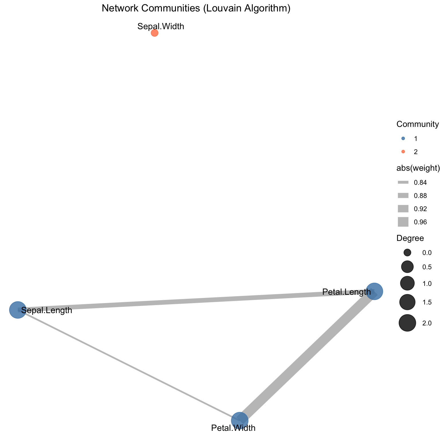
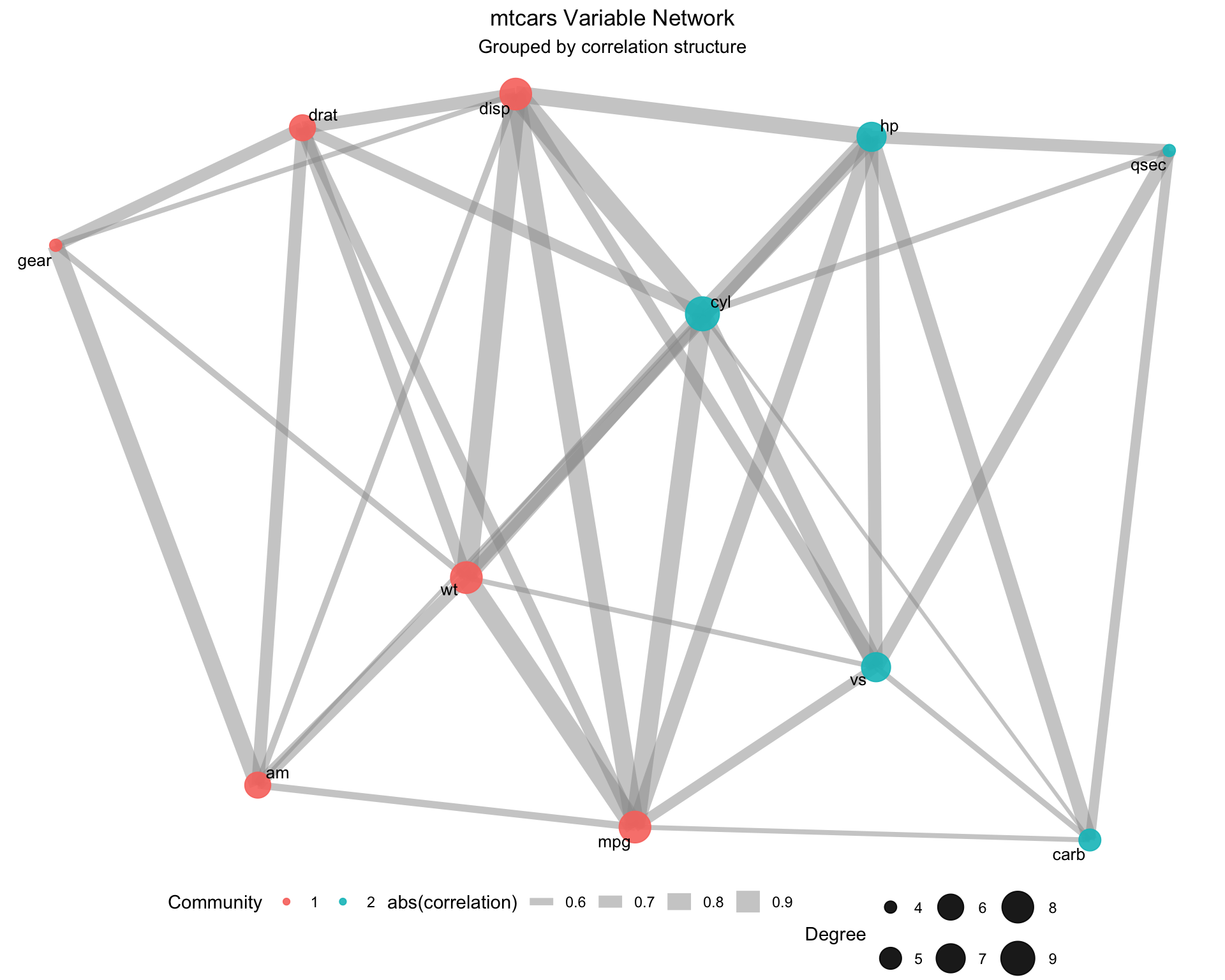
Community detection algorithms partition nodes into groups that are more densely connected within than between groups.

# Detect communities using Louvain algorithm
communities <- cluster_louvain(net_vis)

# Add community membership to network
V(net_vis)$community <- membership(communities)

cat("Number of communities detected:", length(communities), "\n")
Number of communities detected: 2 
cat("Community sizes:\n")
Community sizes:
print(sizes(communities))
Community sizes
1 2 
3 1 

Visualizing communities:

# Create a color palette for communities
comm_colors <- c("steelblue", "coral", "lightgreen", "gold")

net_vis_comm <- as_tbl_graph(net_vis) |>
  mutate(community = V(net_vis)$community)

ggraph(net_vis_comm, layout = 'fr') +
  geom_edge_link(aes(width = abs(weight)), edge_colour = "gray50", alpha = 0.5) +
  geom_node_point(aes(colour = as.factor(community), size = degree(net_vis)), alpha = 0.8) +
  geom_node_text(aes(label = name), repel = TRUE, size = 4) +
  scale_colour_manual(values = comm_colors) +
  scale_size_continuous(range = c(4, 10)) +
  labs(
    title = "Network Communities (Louvain Algorithm)",
    colour = "Community",
    size = "Degree"
  ) +
  theme_void() +
  theme(legend.position = "right", plot.title = element_text(hjust = 0.5))

6.4.3 Global Network Properties

# Compute global network properties
global_properties <- tibble(
  Property = c(
    "Number of Nodes",
    "Number of Edges",
    "Network Density",
    "Average Degree",
    "Average Path Length",
    "Diameter",
    "Transitivity (Clustering Coefficient)",
    "Number of Communities"
  ),
  Value = c(
    vcount(net_vis),
    ecount(net_vis),
    edge_density(net_vis),
    mean(degree(net_vis)),
    mean_distance(net_vis),
    diameter(net_vis),
    transitivity(net_vis),
    length(communities)
  )
)

gt(global_properties) |>
  fmt_number(columns = Value, decimals = 3)
Property Value
Number of Nodes 4.000
Number of Edges 3.000
Network Density 0.500
Average Degree 1.500
Average Path Length 0.884
Diameter 0.963
Transitivity (Clustering Coefficient) 1.000
Number of Communities 2.000

6.5 Part IV: Practical Applications

6.5.1 Application 1: Multivariate Data Exploration

Networks help us understand which variables tend to move together, revealing natural groupings:

# Load a dataset with more variables
# Using mtcars for richer examples
data(mtcars)

# Compute correlation matrix
mtcars_cor <- cor(mtcars)

# Create network with moderate threshold
threshold_mtcars <- 0.5
adj_mtcars <- (abs(mtcars_cor) > threshold_mtcars) * 1
diag(adj_mtcars) <- 0

net_mtcars <- graph_from_adjacency_matrix(
  adj_mtcars,
  mode = "undirected",
  weighted = TRUE
)

# Detect communities
comm_mtcars <- cluster_louvain(net_mtcars)

cat("mtcars Variable Groups:\n")
mtcars Variable Groups:
for (i in seq_along(comm_mtcars)) {
  cat("Group", i, ":", paste(names(mtcars)[membership(comm_mtcars) == i], collapse = ", "), "\n")
}
Group 1 : mpg, disp, drat, wt, am, gear 
Group 2 : cyl, hp, qsec, vs, carb 
# Visualize mtcars network
V(net_mtcars)$community <- membership(comm_mtcars)

# Extract and assign edge weights from correlation matrix
edge_list_mtcars <- as_edgelist(net_mtcars)
edge_weights_mtcars <- numeric(nrow(edge_list_mtcars))
for (i in 1:nrow(edge_list_mtcars)) {
  edge_weights_mtcars[i] <- mtcars_cor[edge_list_mtcars[i, 1], edge_list_mtcars[i, 2]]
}
# Use absolute values for layout algorithm (Fruchterman-Reingold requires positive weights)
E(net_mtcars)$weight <- abs(edge_weights_mtcars)
E(net_mtcars)$correlation <- edge_weights_mtcars

net_mtcars_tidy <- as_tbl_graph(net_mtcars)

ggraph(net_mtcars_tidy, layout = 'fr') +
  geom_edge_link(
    aes(width = abs(correlation)),
    edge_colour = "gray60",
    alpha = 0.5
  ) +
  geom_node_point(
    aes(
      colour = as.factor(V(net_mtcars)$community),
      size = degree(net_mtcars)
    ),
    alpha = 0.9
  ) +
  geom_node_text(aes(label = name), repel = TRUE, size = 3.5) +
  scale_size_continuous(range = c(3, 9)) +
  labs(
    title = "mtcars Variable Network",
    subtitle = "Grouped by correlation structure",
    colour = "Community",
    size = "Degree"
  ) +
  theme_void() +
  theme(legend.position = "bottom", plot.title = element_text(hjust = 0.5), plot.subtitle = element_text(hjust = 0.5))

6.5.2 Application 2: Comparison of Networks

Networks can be compared across subgroups or time periods to identify changing associations:

# Split iris by species and compute networks
iris_setosa <- iris |> filter(Species == "setosa") |> select(-Species)
iris_versicolor <- iris |> filter(Species == "versicolor") |> select(-Species)
iris_virginica <- iris |> filter(Species == "virginica") |> select(-Species)

cor_setosa <- cor(iris_setosa)
cor_versicolor <- cor(iris_versicolor)
cor_virginica <- cor(iris_virginica)

# Create networks for each
threshold_species <- 0.5

create_species_network <- function(cor_mat) {
  adj <- (abs(cor_mat) > threshold_species) * 1
  diag(adj) <- 0
  graph_from_adjacency_matrix(adj, mode = "undirected", weighted = TRUE)
}

net_setosa <- create_species_network(cor_setosa)
net_versicolor <- create_species_network(cor_versicolor)
net_virginica <- create_species_network(cor_virginica)

# Compare network properties
network_comparison <- tibble(
  Species = c("Setosa", "Versicolor", "Virginica"),
  Edges = c(ecount(net_setosa), ecount(net_versicolor), ecount(net_virginica)),
  Density = c(
    edge_density(net_setosa),
    edge_density(net_versicolor),
    edge_density(net_virginica)
  ),
  Avg_Degree = c(
    mean(degree(net_setosa)),
    mean(degree(net_versicolor)),
    mean(degree(net_virginica))
  ),
  Clustering_Coeff = c(
    transitivity(net_setosa),
    transitivity(net_versicolor),
    transitivity(net_virginica)
  )
)

gt(network_comparison) |>
  fmt_number(columns = -Species, decimals = 3)
Species Edges Density Avg_Degree Clustering_Coeff
Setosa 1.000 0.167 0.500 NaN
Versicolor 6.000 1.000 3.000 1.000
Virginica 2.000 0.333 1.000 NaN

6.5.3 Application 3: Partial Correlation Networks

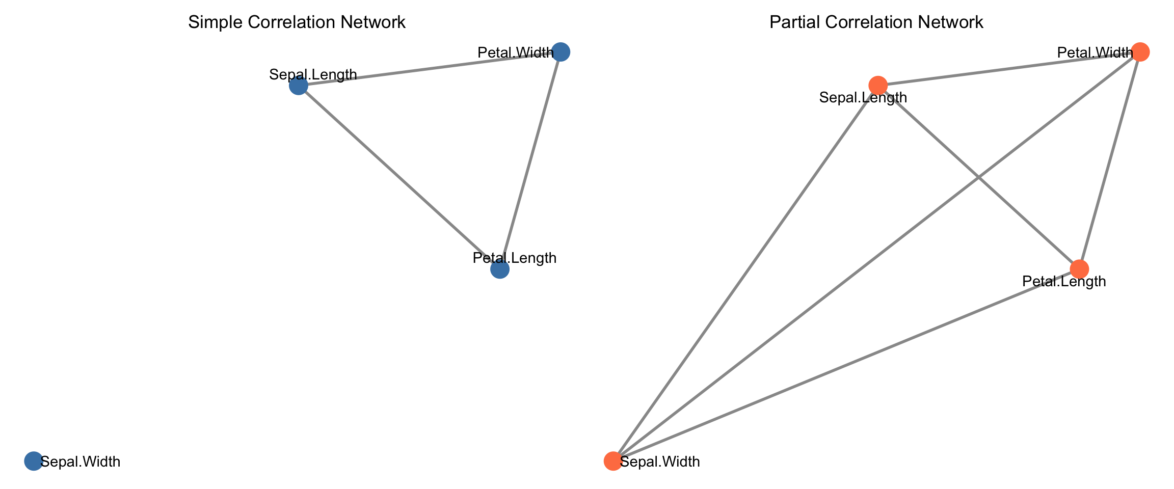
With many variables, simple correlations may be misleading due to confounding. Partial correlations (associations after removing effects of other variables) often reveal cleaner networks.

# Note: Partial correlation computation often uses inverse covariance
# For this example, we'll demonstrate the concept with a simplified approach
# using residuals from regression

compute_partial_corr_approx <- function(data) {
  n_vars <- ncol(data)
  partial_corr <- matrix(1, n_vars, n_vars)
  colnames(partial_corr) <- colnames(data)
  rownames(partial_corr) <- colnames(data)
  
  if (n_vars < 2) {
    return(partial_corr)
  }
  
  for (i in 1:(n_vars - 1)) {
    for (j in (i + 1):n_vars) {
      # Residuals of X_i after removing effects of other variables
      x_other <- data[, -c(i, j), drop = FALSE]
      
      # Create a data frame with response and predictors for regression
      df_i <- cbind(data[, i, drop = FALSE], x_other)
      colnames(df_i)[1] <- "y"
      fit_i <- lm(y ~ ., data = df_i)
      resid_i <- residuals(fit_i)
      
      # Residuals of X_j after removing effects of other variables
      df_j <- cbind(data[, j, drop = FALSE], x_other)
      colnames(df_j)[1] <- "y"
      fit_j <- lm(y ~ ., data = df_j)
      resid_j <- residuals(fit_j)
      
      # Correlation of residuals
      partial_corr[i, j] <- cor(resid_i, resid_j)
      partial_corr[j, i] <- cor(resid_i, resid_j)
    }
  }
  
  partial_corr
}

# Compute partial correlations
partial_cor_iris <- compute_partial_corr_approx(iris_numeric)

# Create network from partial correlations
threshold_partial <- 0.3
adj_partial <- (abs(partial_cor_iris) > threshold_partial) * 1
diag(adj_partial) <- 0

net_partial <- graph_from_adjacency_matrix(
  adj_partial,
  mode = "undirected",
  diag = FALSE
)

# Extract and assign edge weights
edge_list_partial <- as_edgelist(net_partial)
edge_weights_partial <- numeric(nrow(edge_list_partial))
for (i in 1:nrow(edge_list_partial)) {
  edge_weights_partial[i] <- partial_cor_iris[edge_list_partial[i, 1], edge_list_partial[i, 2]]
}
E(net_partial)$weight <- abs(edge_weights_partial)

cat("\nPartial Correlation Network Properties:\n")

Partial Correlation Network Properties:
cat("Edges:", ecount(net_partial), "\n")
Edges: 6 
cat("Density:", edge_density(net_partial), "\n")
Density: 1 

Comparing simple vs. partial correlation networks:

# Simple correlation network
threshold_simple <- 0.55
adj_simple <- (abs(cor_matrix) > threshold_simple) * 1
diag(adj_simple) <- 0
net_simple <- graph_from_adjacency_matrix(adj_simple, mode = "undirected", weighted = TRUE)

# Prepare both networks for plotting
layout_coords <- layout_with_fr(net_simple)

p1 <- ggraph(as_tbl_graph(net_simple), layout = layout_coords) +
  geom_edge_link(edge_colour = "gray60", width = 1) +
  geom_node_point(size = 6, colour = "steelblue") +
  geom_node_text(aes(label = name), repel = TRUE) +
  labs(title = "Simple Correlation Network") +
  theme_void() +
  theme(plot.title = element_text(hjust = 0.5))

p2 <- ggraph(as_tbl_graph(net_partial), layout = layout_coords) +
  geom_edge_link(edge_colour = "gray60", width = 1) +
  geom_node_point(size = 6, colour = "coral") +
  geom_node_text(aes(label = name), repel = TRUE) +
  labs(title = "Partial Correlation Network") +
  theme_void() +
  theme(plot.title = element_text(hjust = 0.5))

p1 + p2

6.6 Part V: Dynamic and Temporal Networks

Networks also reveal patterns across time. When observations represent time periods, we can track how associations evolve.

# Simulate time series data: changing correlations
set.seed(123)
n_obs <- 100
n_periods <- 4

# Create data where correlations change over time
ts_data <- expand_grid(
  period = 1:n_periods,
  obs = 1:n_obs
) |>
  mutate(
    # Variables with period-dependent relationships
    x1 = rnorm(n()),
    x2 = rnorm(n()),
    x3 = ifelse(period <= 2, x1 + rnorm(n(), 0, 0.3), x2 + rnorm(n(), 0, 0.3)),
    x4 = x1 + x2 + rnorm(n(), 0, 0.5)
  )

# Compute correlations per period
cors_by_period <- ts_data |>
  group_by(period) |>
  summarise(
    cor_x1_x3 = cor(x1, x3),
    cor_x1_x4 = cor(x1, x4),
    cor_x2_x3 = cor(x2, x3),
    cor_x2_x4 = cor(x2, x4),
    cor_x3_x4 = cor(x3, x4),
    .groups = "drop"
  )

# Visualize changing correlations
cors_by_period |>
  pivot_longer(cols = -period, names_to = "Edge", values_to = "Correlation") |>
  ggplot(aes(x = period, y = Correlation, colour = Edge, linetype = Edge)) +
  geom_line(linewidth = 1) +
  geom_point(size = 2) +
  geom_hline(yintercept = 0, linetype = "dashed", colour = "gray50") +
  scale_x_continuous(breaks = 1:n_periods) +
  labs(
    title = "Network Evolution Over Time",
    x = "Time Period",
    y = "Correlation Coefficient",
    colour = "Variable Pair",
    linetype = "Variable Pair"
  ) +
  theme_minimal() +
  theme(legend.position = "right")

6.7 Summary and Key Takeaways

  • Networks transform complexity: Large correlation matrices become interpretable visualizations and metrics.
  • Thresholding is essential: Choose thresholds that balance information retention with interpretability.
  • Layout matters: Different graph layouts reveal different structural properties. Force-directed layouts typically highlight clustering.
  • Centrality measures identify hubs: Variables with high degree or betweenness centrality are important connectors.
  • Communities reveal natural groupings: Automated algorithms partition variables into clusters with strong internal associations.
  • Partial correlations remove confounding: Networks based on partial correlations often reveal cleaner, more interpretable structure.
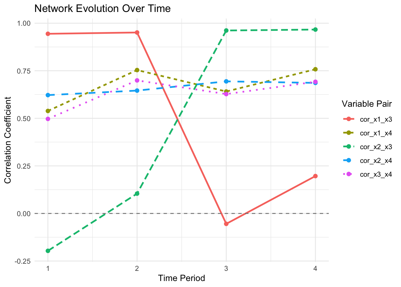
  • Networks change over time: Tracking network evolution reveals how associations shift across contexts or periods.

6.8 Looking Ahead

With network representations now providing a topological view of associations, we shift from static visualization to interactive exploration. The next chapter introduces Shiny applications that enable dynamic network exploration: hovering over nodes to highlight connections, filtering by community membership, adjusting thresholds in real-time, and comparing networks across subgroups without recomputing layouts. This interactivity transforms networks from publication-ready static images into powerful exploratory tools for discovering patterns that static visualizations cannot convey. Interactive tools amplify our ability to interrogate high-dimensional data structures and communicate findings effectively to diverse audiences.